Beyond Google Maps: A Guide to Business Mapping & Location Analysis
Google Maps for business analysis seems like it should be enough — until you actually try it.
Your sales team needs to visualize where accounts cluster. Your marketing director wants to see lead density by region. Your ops manager is trying to figure out which territories are under-performing.
And the first thing everyone reaches for? Google Maps.
It’s free. It’s familiar. It’s already on every phone and laptop in your organization.
But here’s the thing — Google Maps was built for navigation and local search, not for business intelligence.
The moment you try to layer in CRM data, compare revenue across regions, or spot coverage gaps in your sales territories, it falls apart fast.
This article breaks down exactly where Google Maps hits its ceiling for business use cases — and shows you what to reach for (and how to use it) when your team needs more.
Google Maps Has No Native Business Data Layering
This is the first wall every team runs into.
You’ve got a spreadsheet full of customer addresses, revenue figures, deal stages, or demographic data. You want to see it all on a map.
Google Maps doesn’t do that.
Sure, you can drop pins manually or import a basic CSV into Google My Maps. But there’s no real way to overlay multiple datasets, color-code by revenue tier, or visualize density patterns from your own business data.
Here’s what that actually means in practice:
- No CRM data overlays — You can’t pull Salesforce or HubSpot exports and layer them meaningfully onto a Google Map
- No revenue visualization — There’s no way to shade regions by deal size, revenue, or conversion rate
- No demographic layering — You can’t combine Census data, income brackets, or market penetration on the same view
- No multi-layer support — Want to see customers, prospects, and competitors on one map? Not happening
What this looks like in BatchGeo
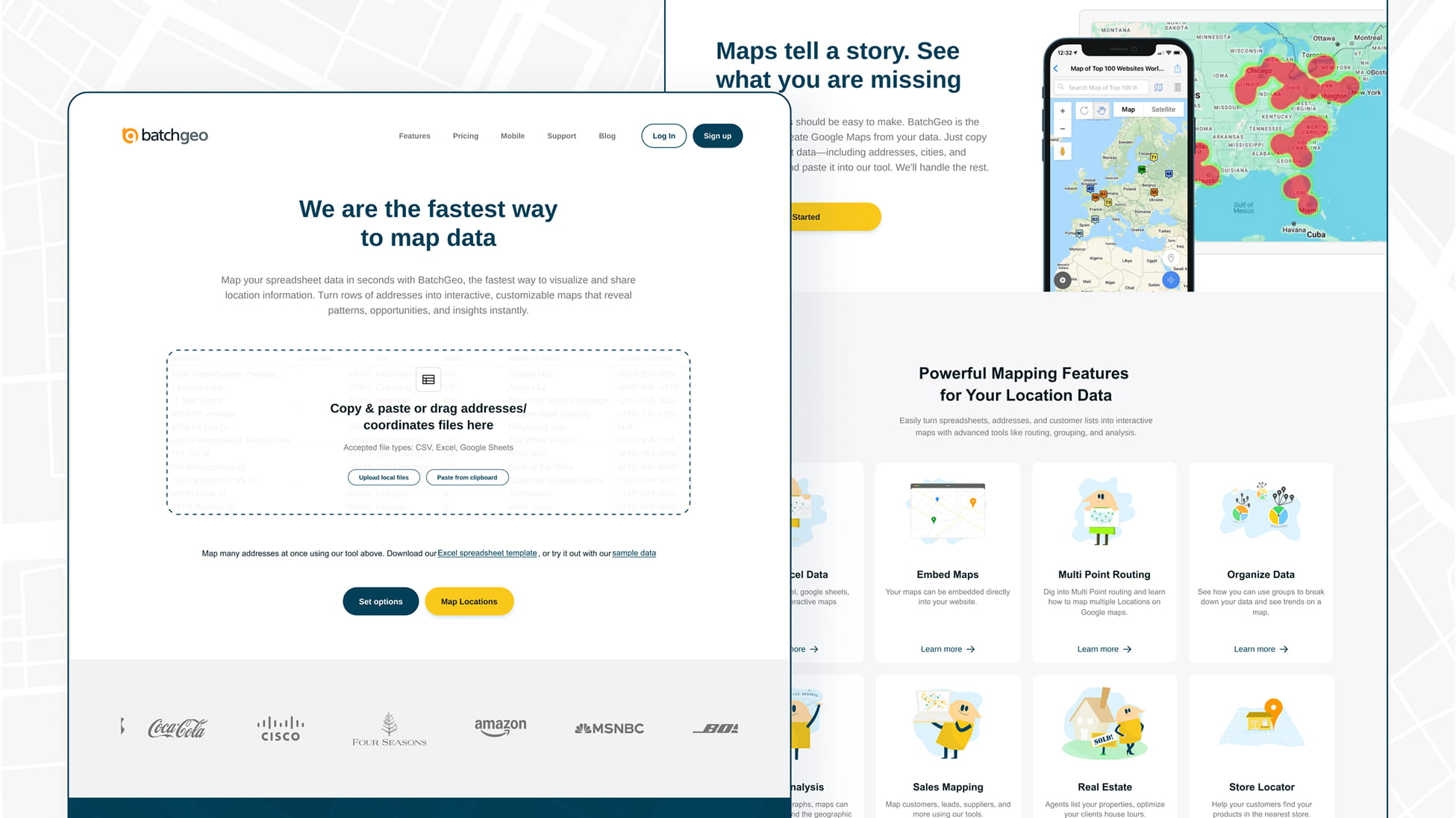
With BatchGeo, you can go from spreadsheet to interactive map in about 60 seconds. Here’s the actual workflow:
- Open your spreadsheet (Excel, Google Sheets, CSV — whatever you have) with all your business data: addresses, revenue, rep names, deal stages, categories
- Highlight and copy the rows, including the header row
- Go to batchgeo.com and paste your data into the input box
- Click “Validate and Set Options” to confirm your location columns, then hit the button to map your data — BatchGeo geocodes everything automatically
Interactive Maps Made Easy
Sign Up NowThat’s it. All your additional columns — revenue, categories, rep assignments — come along for the ride and become interactive, filterable data layers on the map.
No reformatting. No stitching together workarounds. Just paste your data and see the full picture.
Going deeper: If you want to prep your spreadsheet for the best possible results, check out How to Prepare Your Data for a Map — it covers column ordering, group optimization, and formatting tips.
No Territory Management or Sales Planning Tools
If you’re in sales ops or revenue operations, territory planning is one of your highest-leverage activities.
Balanced territories mean balanced workloads. Balanced workloads mean better coverage. Better coverage means more revenue.
Google Maps has zero territory management capabilities.
You can’t:
- Define geographic boundaries for sales territories
- Assign accounts to reps based on location, revenue potential, or workload
- Visualize overlap or white space between territories
- Group and filter data to see how accounts break down by region, rep, or category
What usually happens instead? Someone draws territory lines on a screenshot. Someone else builds a color-coded spreadsheet. A third person makes a PowerPoint slide with shapes layered on top of a map image.
None of it connects. None of it updates. And none of it scales.
How to see territory breakdowns in BatchGeo
BatchGeo won’t auto-draw territory boundaries for you — but it gives sales leaders something arguably more useful: instant visual clarity on how accounts actually distribute across reps and regions.
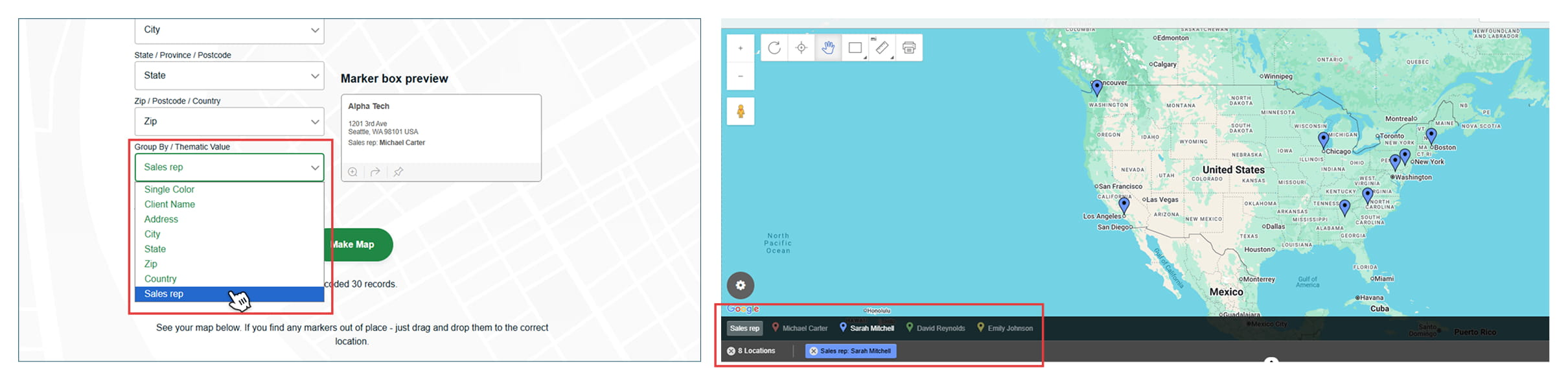
Here’s how the grouping feature works:
- Make sure your spreadsheet has a column for the data you want to group by (e.g., “Sales Rep,” “Region,” “Territory,” or “Product Line”)
- Paste your data and create your map
- BatchGeo automatically detects groupable columns and color-codes your markers accordingly
- Use the dropdown in the lower left of the map to switch between group views — toggle from “Sales Rep” to “Deal Stage” to “Revenue Range” instantly
- Click specific groups in the legend to filter the map down to only those markers
You can even stack multiple filters at once — show only the accounts in the $50K–$100K revenue range assigned to a specific rep, for example.
That kind of on-the-fly filtering is impossible in Google Maps.
Going deeper: For a full walkthrough on grouping (including multi-column filtering), see Use Grouping to Make the Most of Your Map and Streamline Your Map Filters in BatchGeo.
No Analytical or Visualization Tools for Your Own Data
Google Maps is great at showing you where a coffee shop is. It’s terrible at showing you where your business is winning or losing.
When teams try to use Google Maps for business analysis, they quickly discover there are no built-in analytical tools for their own datasets:
- No filtering — You can’t filter map markers by deal stage, account size, or date range
- No aggregation — There’s no way to roll up data by zip code, county, or custom region
- No heat maps from your data — Google Maps shows traffic heat maps, not your revenue heat maps
- No choropleth maps — You can’t shade geographic areas based on your own performance metrics
- No clustering — Large datasets just become a mess of overlapping pins
How to create heat maps and choropleth views in BatchGeo
This is where purpose-built mapping tools pull way ahead — and where BatchGeo gives you two powerful visualization options that Google Maps simply doesn’t offer.
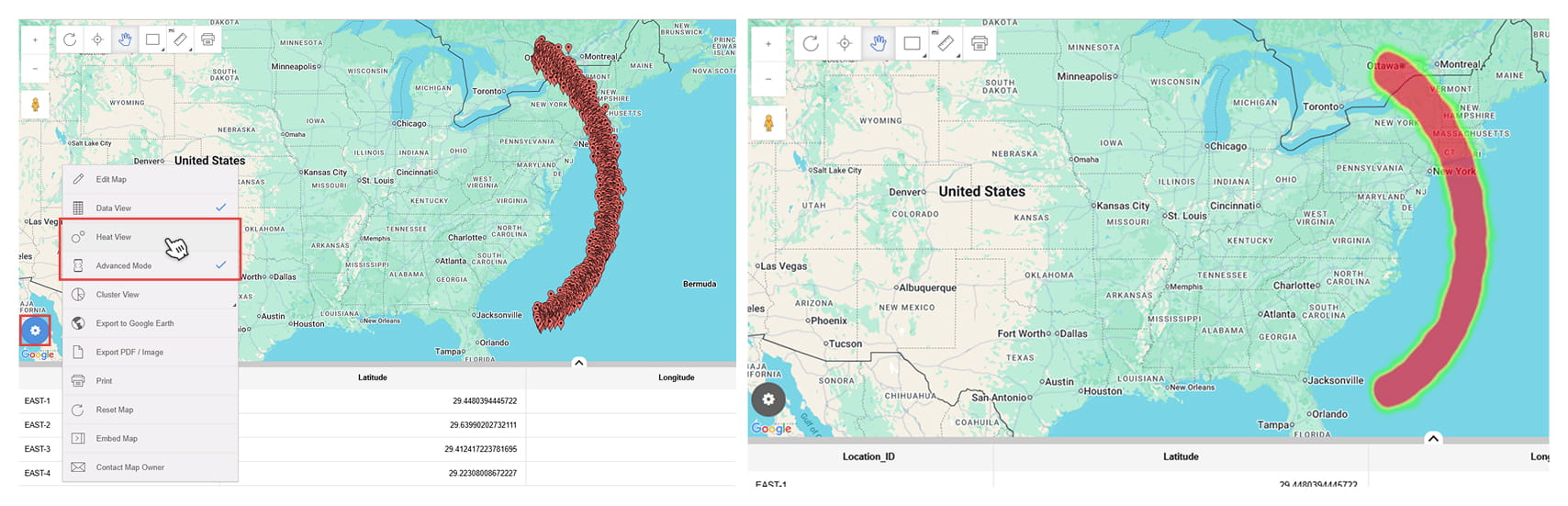
Heat maps (Pro feature):
Heat maps show you where your data is most concentrated — the “hot spots” in your geographic data.
- Create your map using the standard copy-paste workflow
- Right-click anywhere on the map
- Select “Heat View” from the context menu
- Your markers transform into a density visualization — reds and oranges where data clusters, cooler colors where it thins out
This is especially useful for spotting customer density patterns, identifying under-served areas, or visualizing where leads are concentrated vs. where your reps are actually spending time.
Interactive Maps Made Easy
Sign Up NowGoing deeper: See A Heat Map Function for Your Excel Spreadsheet for a step-by-step walk-through.
Choropleth (boundary) maps:
Choropleth maps shade geographic boundaries (like zip codes, counties, or states) based on an aggregated data value. Think of it like a color-coded performance report — but on a map instead of a spreadsheet.
When creating your map on batchgeo.com:
- Paste your data and click “Validate and Set Options” to confirm your columns
- After setting your options, proceed to map your data
- During this step, you’ll be able to select the boundary map style — BatchGeo groups your data by postal code or governmental boundaries and shades areas based on the values in your dataset
This is ideal for revenue-by-region breakdowns, market penetration analysis, or comparing performance across geographies.
Going deeper: The step-by-step process is covered in detail in Make a Boundary Map With Spreadsheet Data — including how to prepare your data for the best results.
Marker clustering:
If you’re working with thousands of data points, BatchGeo also offers marker clustering — automatically grouping nearby markers into summary circles that show count, average, or sum of a selected column.
- When creating your map, click “Validate and Set Options” then “Advanced Options”
- Check “Enable Clustering”
- Select the aggregation method (count, average, or sum) and the column to aggregate
Instead of a wall of overlapping pins, you get readable summary markers that reveal the story within your data.
Going deeper: How to Cluster Map Markers: Demo and Tutorial walks through every clustering option with examples.
Google My Maps Collaboration Is Painfully Limited
Let’s talk about Google My Maps, since that’s what most teams default to when they need “something more” than basic Google Maps.
My Maps is better than nothing. But it’s barely better than nothing.
Here’s where it falls apart for teams:
- 2,000-row limit — If your dataset is bigger than 2,000 records, you’re done
- No real-time collaboration — Multiple people can’t meaningfully work on the same map simultaneously
- No role-based access — You can’t control who edits vs. who views
- No version history for data — If someone deletes a layer, it’s gone
- Clunky sharing — Sharing a My Map link feels like sharing a Google Doc from 2012
For a two-person team doing a quick visual check, My Maps is fine.
For a sales org that needs shared territory views and the ability to quickly reference account locations — it’s a non-starter.
Sharing and embedding with BatchGeo
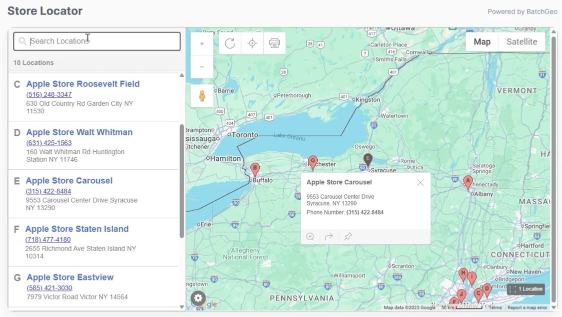
BatchGeo maps are shareable by link — every map gets a unique URL (e.g., batchgeo.com/map/your-map-id) that you can drop into an email, Slack message, or team wiki.
Need to put it on a webpage or internal portal? BatchGeo generates an embed code you can paste into any site — the map stays fully interactive, groupable, and filterable for anyone who views it.
On paid plans, BatchGeo supports datasets up to 100,000 data points — a fundamentally different scale than My Maps’ 2,000-row ceiling.
You can also export maps to Google Earth (KML) or to PDF and PNG formats (Pro) for presentations and reports.
No Integration With Your Business Workflows
This is the one that kills productivity the most.
Google Maps doesn’t connect to your:
- CRM (Salesforce, HubSpot, Dynamics)
- Spreadsheet pipelines in any automated way
- BI tools (Looker, Tableau, Power BI)
- Internal reporting dashboards
Every time your data changes, someone has to manually re-export, re-format, and re-upload.
That’s not a workflow. That’s a bottleneck.
Teams end up spending hours a week just maintaining their Google Maps visualizations — downloading CSVs, cleaning addresses, re-importing into My Maps, and then screenshotting the results for a slide deck.
The real cost isn’t the tool. It’s the time your team burns working around the tool’s limitations.
How BatchGeo fits into your existing workflow
BatchGeo is built around the spreadsheet workflow most business teams already use.
The typical flow looks like this:
- Export from your CRM or data source → CSV or Excel file
- Copy the data (Ctrl+C / Cmd+C)
- Paste into batchgeo.com (Ctrl+V / Cmd+V)
- Map is live — grouped, filterable, and shareable
When your data changes, you update the map just as fast — edit your saved map and paste in the updated data.
Interactive Maps Made Easy
Sign Up NowNo API configuration. No developer involvement. No waiting on IT.
BatchGeo also supports Excel (.xlsx, .xls), CSV, Google Sheets, and tab-delimited text files, so it works with whatever format your system exports.
Going deeper: How to Map Excel Data covers the full import process with tips for getting the cleanest results.
Google Maps Is Static — Not Strategic
Here’s the fundamental problem with using Google Maps for business analysis.
It shows you where things are. It doesn’t tell you what to do about it.
Google Maps can show you that you have customers in the Dallas metro area. It can’t tell you:
- How those accounts group by product line, deal stage, or revenue
- Where the density gaps are between your top-performing regions
- Which areas have high concentration but low revenue — or vice versa
- What the optimal route looks like for a rep visiting multiple accounts in a day
Business mapping needs to be strategic, not static.
Route optimization: from map to action
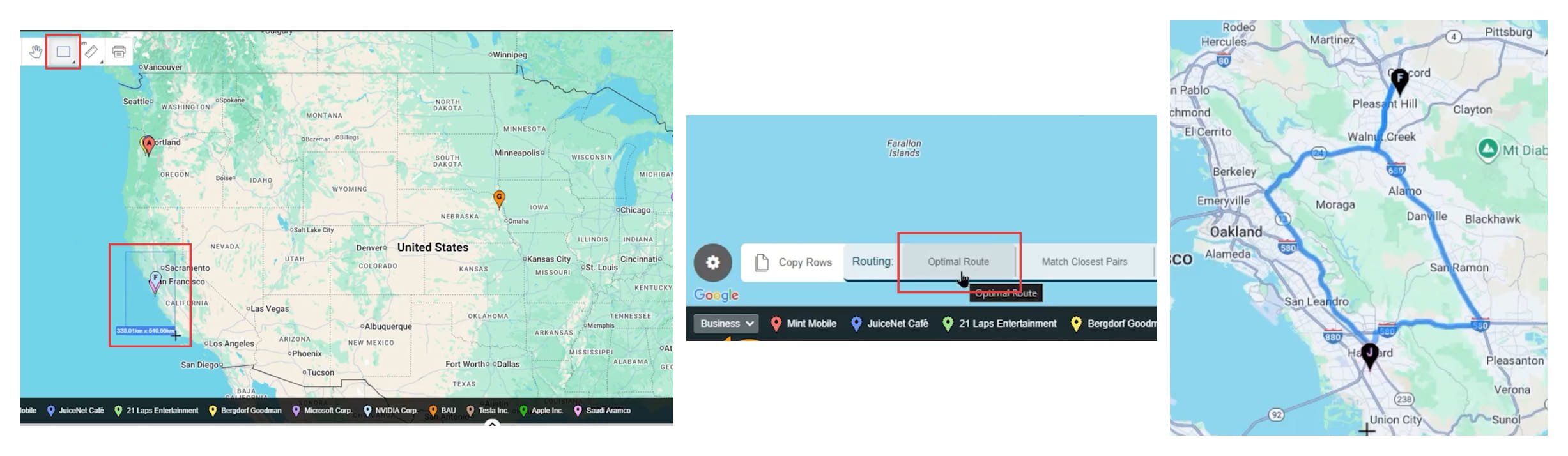
This is a perfect example of the gap between “viewing data” and “acting on data.”
With BatchGeo Pro, you can go from looking at your accounts on a map to planning an optimized route between them — directly inside the tool:
- Right-click your map and turn on “Data View” or “Advanced Mode”
- Select the locations you want to visit using the rectangle, circle, or polygon selection tool (or Shift+click rows in the data table)
- Click “Optimal Route” in the lower left corner
- Choose your starting and ending locations
- BatchGeo calculates the most efficient path between up to 25 stops
For field sales reps, service teams, or anyone doing multi-stop visits — this turns a static customer map into an actual daily action plan.
Going deeper: Map Your Optimal Route to Custom Locations walks through the full route planning workflow.
What to Look for When You’ve Outgrown Google Maps
If any of the pain points above sound familiar, you’re not alone. Most growing teams hit this wall somewhere between 50 and 500 accounts.
Here’s what to look for in a business mapping solution:
- Easy data import — Copy-paste from spreadsheets without complex formatting requirements
- Multi-layer visualization — Overlay customers, prospects, revenue data, and categories on a single interactive map
- Grouping and filtering — Slice your map view by any column in your dataset to isolate what matters
- Heat maps and choropleth views — Visualize density and performance by geography using your own data
- Marker clustering — Summarize large datasets without overwhelming the map
- Route optimization — Plan efficient multi-stop routes for field teams directly from your mapped data
- Shareability — Send maps by link, embed them on internal pages, or export for presentations
- Scalability — Handle thousands (or tens of thousands) of data points without breaking
- Low barrier to entry — Your team should be mapping data within minutes, not weeks
BatchGeo checks every one of these boxes — and you can start mapping for free right now to see how it handles your data.
When It’s Time to Make the Switch
You don’t need to abandon Google Maps entirely. It’s still great for what it was designed to do — directions, local search, quick lookups.
But if your team is:
- Spending hours manually maintaining map visualizations
- Making territory decisions based on gut feel instead of data
- Missing coverage gaps or market opportunities because you can’t see them
- Screenshotting maps for presentations instead of sharing interactive views
- Hitting the 2,000-row limit in My Maps regularly
Then you’ve outgrown Google Maps for business analysis.
And every week you wait is a week of lost insight.
The good news? You don’t need an expensive enterprise GIS platform to fix this. You just need a tool that was built for what you’re actually trying to do.
Frequently Asked Questions
Can I use Google Maps for basic sales territory mapping?
You can drop pins and draw shapes manually, but Google Maps has no real territory management features. You can’t assign accounts, balance workloads, or visualize coverage gaps. For anything beyond a quick visual reference, you need a tool like BatchGeo that lets you group data by rep, region, or any other column in your spreadsheet.
What’s the main difference between Google My Maps and BatchGeo?
Interactive Maps Made Easy
Sign Up NowGoogle My Maps caps at 2,000 rows with limited visualization options. BatchGeo supports up to 100,000 data points (on paid plans), offers heat maps, choropleth views, data grouping, route optimization, and embeddable maps — all from a simple copy-paste workflow.
Is Google Maps API a better option for business analysis?
The Google Maps API gives you more control over how maps render, but it’s a development tool — not an analysis tool. You’d need to build custom applications on top of it, which means engineering time and ongoing maintenance. For most business teams, a purpose-built mapping tool like BatchGeo is faster and more practical.
What types of businesses benefit most from switching to BatchGeo?
Any organization with field teams, distributed customers, multi-location operations, or regional performance metrics. This includes sales-driven companies, healthcare networks, retail chains, logistics operations, real estate firms, and franchise businesses.
How do I know when my team has outgrown Google Maps?
If you’re manually exporting data, stitching together multiple My Maps, screenshotting maps for reports, or making territory decisions without spatial analysis — you’ve already outgrown it. The fix is usually faster than you’d expect.
Can BatchGeo replace my BI dashboard?
BatchGeo isn’t designed to replace your full BI stack. It adds a geographic visualization layer on top of your existing data. Think of it as the map view your spreadsheets and dashboards are missing — turning rows of addresses and metrics into interactive, visual intelligence.
How fast can I get started with BatchGeo?
Minutes. Copy your spreadsheet data, paste it into BatchGeo, and your map is live. No software installation, no API keys, no developer needed. You can create your first map for free right now.
Google Maps for business analysis is one of those things that seems like it should work — right up until it doesn’t.
The gap between “I can see pins on a map” and “I can make strategic decisions using geographic data” is massive.
Most teams don’t realize how much time, accuracy, and insight they’re leaving on the table until they switch to something built for the job.