The Complete Guide to Conditional Formatting in Excel
Spreadsheets are known to be one of the best places to store your data. But with large datasets, it can be difficult to identify trends in your information. To get to the real story behind your values, you need an easy way to narrow down what’s important. Enter Excel’s conditional formatting tool. We’ll cover what conditional formatting is and does, along with step-by-step instructions on how to implement it in your own spreadsheets:
- What Is Conditional Formatting?
- The 8 Conditional Formatting Rules Explained
- Maps Offer More Data Analysis
Let’s kick off this guide with a clear overview of this popular Excel tool.
What Is Conditional Formatting?
Let’s say you have a spreadsheet containing hundreds of cells of data. While each piece of information is important to the big picture, you might strain your eyes reading every single data point. You’re often just looking for specific numbers or textual info—say a range of the highest and/or lowest data.

In that case and many others like it, a way to zero in on the data that fits what you’re looking for would save time, keeping you focused on the information that matters. What better way than to specially format the desired cells to draw your attention? To ensure you continue to save time, this should be a fairly automatic process, which is exactly what conditional formatting does with its eight rules.
The 8 Conditional Formatting Rules Explained

Now that we better understand the purpose of conditional formatting, let’s jump into some of the various options or rules within the conditional formatting tool itself, including:
- Highlight Cell Rules
- Top/Bottom Rules
- Data Bars
- Color Scales
- Icon Sets
- New Rule
- Clear Rules
- Manage Rules
While we find ourselves reaching most often for the highlight and new (custom) rules, the others also have their specific uses, as we’ll identify.
Highlight Cell Rules
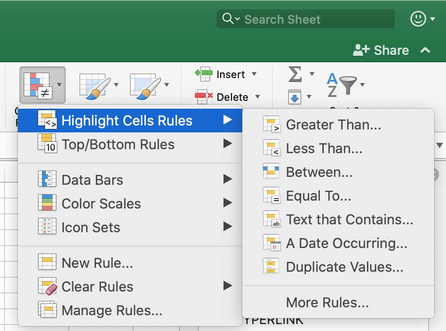
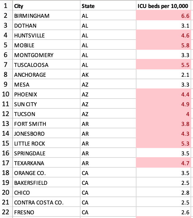
The first conditional formatting rule allows you to automatically highlight the data you specify. Whether that be numerical (for example, any data Greater Than the national average of 3.6 ICU beds per 10,000) or textual data, you’ll find an option that works for your information.
Interactive Maps Made Easy
Sign Up Now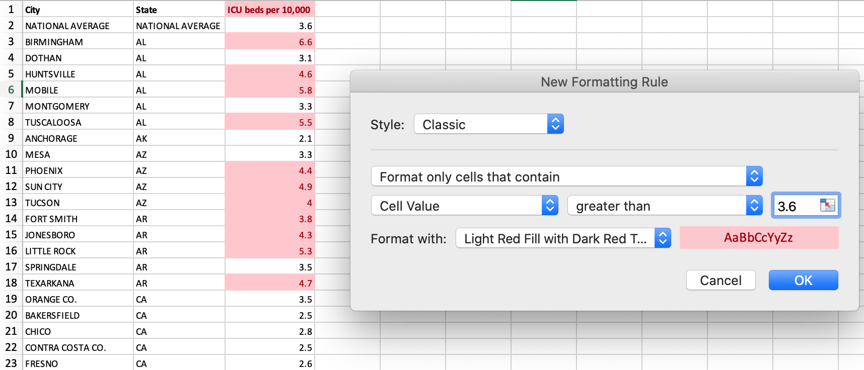
You can even use custom Excel formulas to determine the data to format. There are hundreds of TRUE or FALSE formulas ranging from basic to complex. To use this option:
- Open your spreadsheet
- Select the desired data column(s) you wish to manipulate within the sheet
- Either navigate to menu Format and Conditional Formatting… or in the Home tab, click Conditional Formatting
- Click Highlight Cell Rules
Highlight Cell Rules includes Excel’s easy way to find duplicates via Duplicate Values. For all of the above, you may choose to leave Excel’s default formatting settings (which determine the text and fill color for your highlight). Otherwise, you can opt for custom formatting.
Top/Bottom Rules
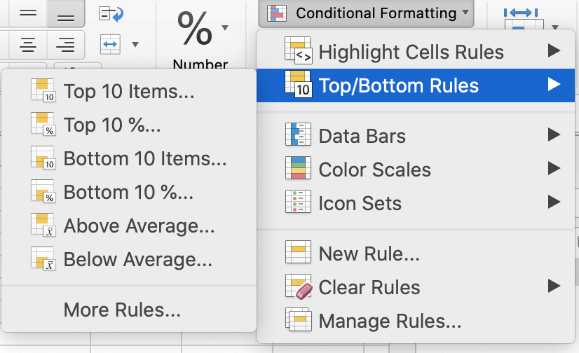
This second handy rule automatically formats the top or bottom range of your data. Whether that’s items, percentages, or averages is up to you. Unlike our Highlight Cell Rules example above, if you opt to go the average route, there’s no need to calculate nor input an average beforehand—let Excel do the math for you.
To get started with this rule, open your spreadsheet and select your desired data column(s). Then, either navigate to menu Format and Conditional Formatting… or in the Home tab, click Conditional Formatting and select for Top/Bottom Rules.
Data Bars, Color Scales, & Icon Sets
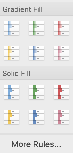
These three conditional formatting rules take data visualization to the next level. For example, with Data Bars, the longer the bar, the higher the value of the data. As with every option, you decide the formatting. In this specific case, choose between Gradient or Solid Fill for your data bars.
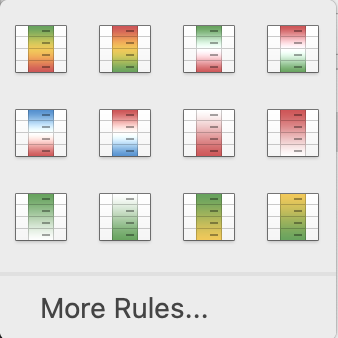
Instead of a bar, Color Scales assigns a color shade to a cell’s value. A 2 or 3-Color Scale corresponds to the minimum, midpoint, and maximum thresholds of your data.
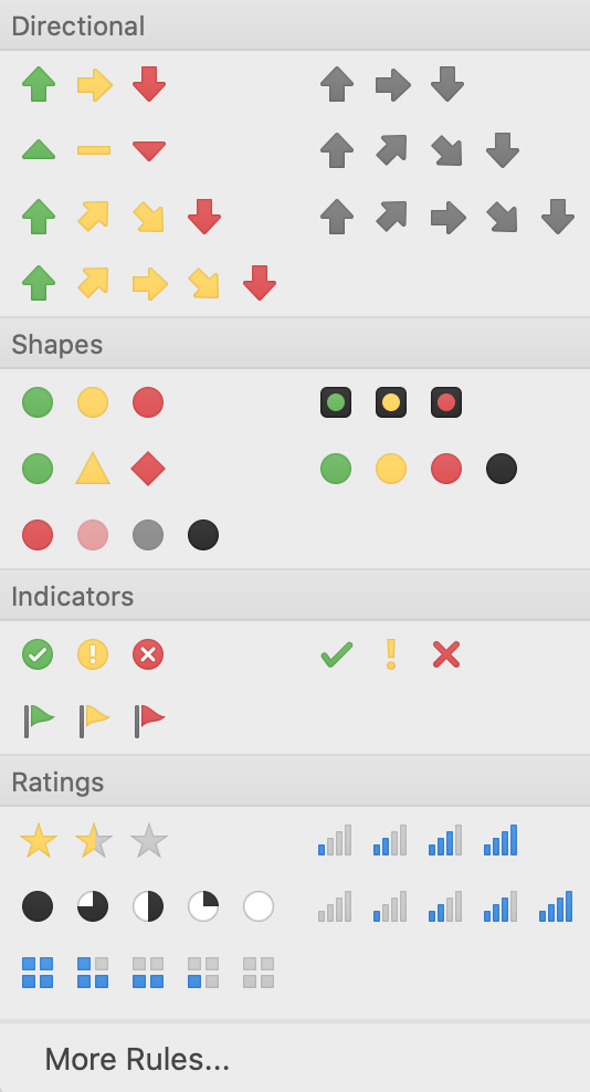
Icon Sets, on the other hand, utilize icons to represent your data. Choose from directional icons like arrows, various shapes or other indicators, and rating icons. Then, designate icons for values greater than, less than, or equal to your data. To incorporate any of these visual effects in your sheets:
- Open your spreadsheet
- Select the desired data column(s)
- Either navigate to menu Format and Conditional Formatting… or in the Home tab, click Conditional Formatting
- Select your desired visual option
Choosing your bar, color scale, or icon is a pretty customized option. But for even more customization, you can create your own conditional formatting rules.
New, Clear, & Manage Rules
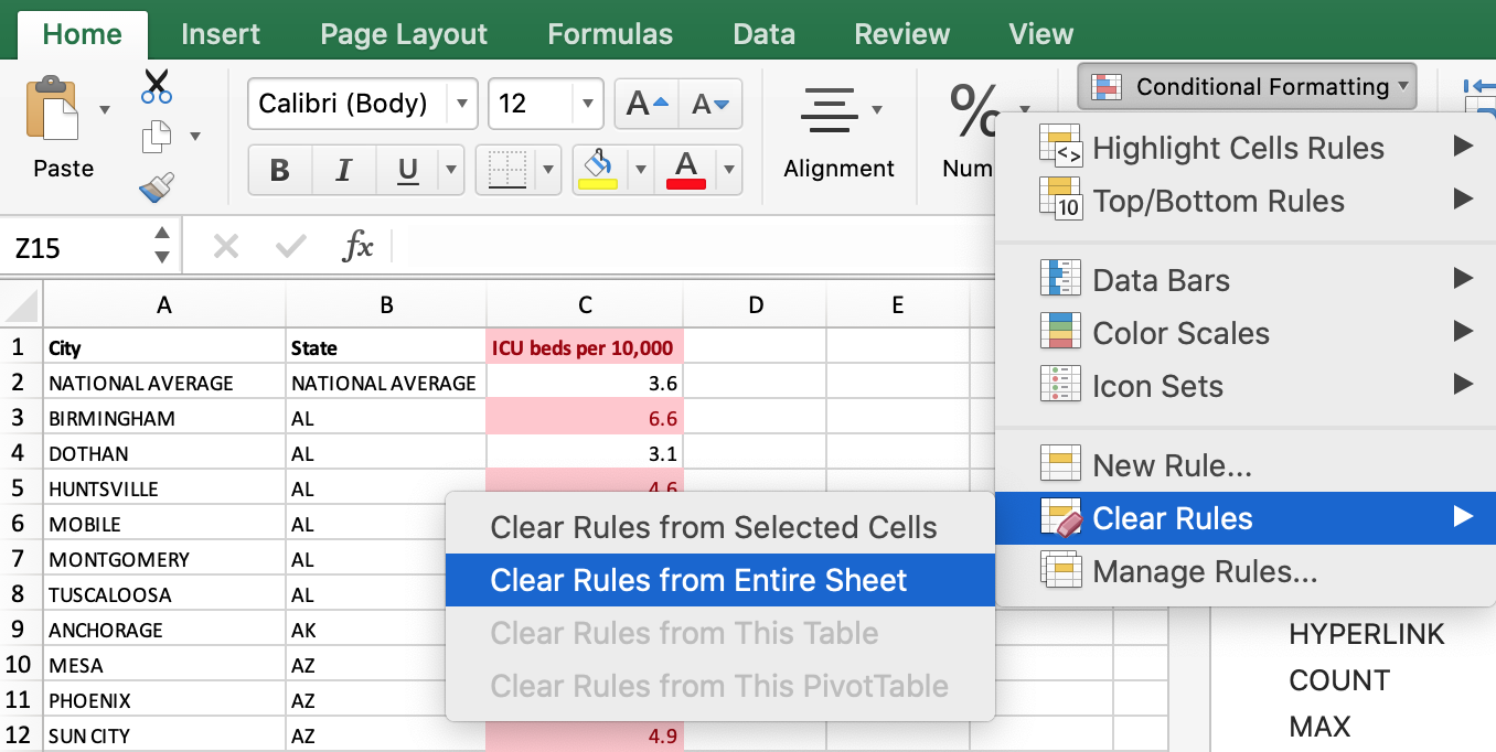
The final conditional formatting options allow you to easily add a new rule or modify the rules you’ve already set up. With Clear Rules, you have the choice to clear the entire sheet of rules or just certain cells you’ve selected.
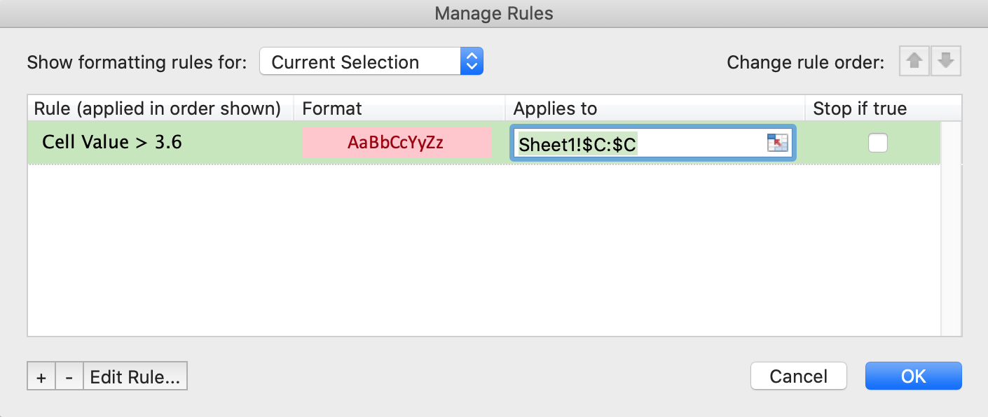
When you Manage Rules, you’ll see a convenient list of everything you’ve set up in your spreadsheet. You can edit, change the rule order, or make a number of other modifications here. As the last of the conditional formatting options, let’s now see how else we can analyze data.
Maps Offer More Data Analysis
In addition to examining data with Excel’s tools, (you can check out our other Excel posts, like How to Find Duplicates in Excel and 5 Excel Tips From the Guy Who Built It, there are other ways to level up your data analysis. One such way is mapping. With a map of your location data, you get a visual element of data analysis (much like conditional formatting), though maps provide far more than a simple highlight, as you can see below.
View ICU beds by city in a full screen map
Visualize your data as markers on a custom map with multiple map marker colors, automatic grouping, and more. This gives you better insight into your data than if you’d left it in a spreadsheet. You can get started mapping your spreadsheets and check out all that comes with it at batchgeo.com.