Excel Data Visualization Examples
Sometimes data is difficult to wrap your head around. That’s where data visualization, or crafty graph work, comes in. You can use the same tool you’re likely already employing to store and manipulate your data — Microsoft Excel — to visualize the very same data. Excel is a formidable tool for data visualization.
Your Excel data probably looks similar to the data above. But it can be difficult for numbers to communicate data-related trends. Common data visualization examples using Excel feature charts, graphs, combinations, and their derivatives. Such diagrams speak a thousand words that can be hard to find in data.
Create Basic Data Visualizations in Excel
There are a number of visualization tools within Excel. While the multiple options can be overwhelming, you can get a lot of mileage out of the simplest of charts.
Bar and Column Chart Examples
Bar and column charts are understandable by even elementary and middle school children. The taller columns (vertical) or longer bars (horizontal) describe the data. You can even include multiple data to compare over time or for other situations.
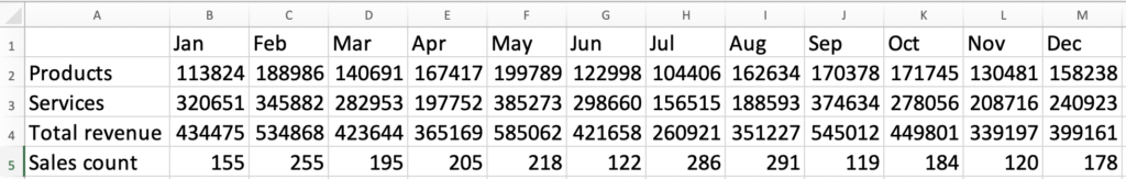
Our sales data shows product and services revenue by month. When translated into a column chart, as above, you can see that services are always higher than products, but more volatile. It would be hard to get this story from numbers alone!
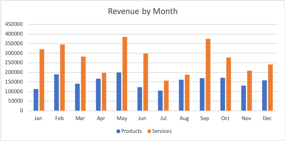
The same data can also be turned into a bar chart. In this case, and likely with most time-series data, column charts actually work best.
How to create a bar or column chart:
- Select your data
- Click Insert → Chart
- Select Column or Bar
Your version of Excel may have slightly different menus. You can also click an icon that looks like a chart or graph.
Line Graph Examples
Line graphs are more suitable for cases where individual data points are not so important. Technical analysis can build upon a simple line graph, including regression quotients, slope values, and extrapolation.
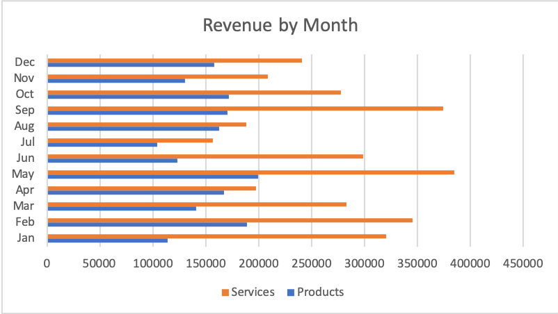
On the line graph example above, we’ve used the same data as before, but there are a few differences: we’re showing the total number of sales (instead of revenue) and it’s displayed over time in a way that may better explain the trends in this business.
Interactive Maps Made Easy
Sign Up NowHow to create a line graph:
- Select your data
- Click Insert → Chart
- Select Line
Pie Chart Examples
Pie charts may be the most appealing of all the data visualization options. In a nutshell, pie charts are circular depictions of statistical proportions, using divisions. The bigger the slice of the pie, the larger the representation, and more generally, the importance.

Using another “slice” of the same data, we can see which regions provided most of the revenue.
How to create a pie chart:
- Select your data
- Click Insert → Chart
- Select Pie
Advanced Excel Data Visualization Examples
Advanced data visualizations become important when simpler diagrams just won’t cut it. This could be the case when there isn’t much difference between values, or you want to communicate multiple values at once.
Combine Charts and Graphs
We’ve shown revenue by month, in dollars. And we’ve shown sales by month, in number of purchases. Each is useful in its own way, but a more complete picture comes into view when we combine them in a single data visualization.
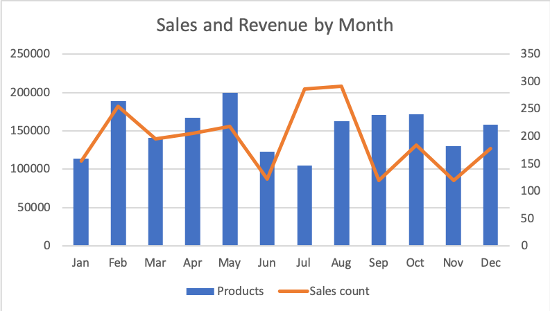
In July and August, there are a lot of sales, but there’s less revenue per sale. That story wasn’t easily visible before we merged the line graph and column chart.
How to create a combo chart:
- Select your data
- Click Insert → Chart
- Select Column
- Click Change Chart Type → Select Combo
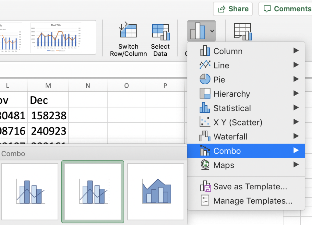
The advanced type of a combo chart is not available in the first menu. However, you can change the type to include a column and line. Notice the selected option has the line values on the second Y-axis —that allows you to show different scales in a single chart.
Create Stacked Charts
Another advanced chart type is a stacked chart. Here we’ll use the exact same data as in our first column chart, but the information will be displayed in a smaller space, with a single column per month.

The added benefit here is that we’re more easily showing the total revenue per month. So, three values are communicated in each month’s column. The stacked chart is an advanced Excel visualization option that really packs a punch!
How to create a stacked chart:
- Select your data
- Click Insert → Chart
- Select Column
- Click Change Chart Type → Select Column → Select the visual of stacked columns
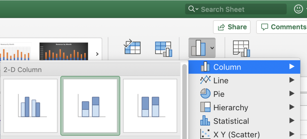
As with the combo chart, you need to dig into the chart type menu and select it visually. Of course, there’s a lot more you can do with chart design, but Excel can’t do quite every visualization, as we’re about to see.
Visualize Excel Data on a Map
One of the best ways to show data visually is with a map. Not all data fits this model, but if you have places—address, cities, or postal codes—plotting them on a map makes a lot of sense. Excel can’t do this itself, but luckily, BatchGeo’s Excel mapping tool makes it easy.
Plot Addresses as Map Markers
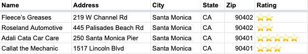
To make a map, make sure your Excel spreadsheet — or Google Sheet or Numbers — contains location data. Take the above spreadsheet about car mechanics around the Santa Monica area, which we used to make the following map.
View Santa Monica Mechanics (with Ratings) in a full screen map

How to:
- Copy and paste your spreadsheet data into batchgeo.com
- Check to make sure you have the proper location data columns available by clicking “Validate and Set Options”
- Select the proper location column from each drop down
- Click “Make Map” and watch as the geocoder performs its process
Sum and Average Data in Map Clusters

Maps are a great way to visualize data. However, we can often find ourselves with more than just four data points. When “marker overload” leaves you with hundreds of markers on your map, preventing you from seeing trends clearly, you can summarize and average your data with map clustering.
View Household income, average clustering in a full screen map
Let’s say you have data similar to the map above which contains the household income of over 3,000 U.S. counties. Without map clustering, the would appear crowded and you may struggle to visualize your data. By following the steps below to enable map clustering, you’ll once again be able to visualize your data clearly.
Interactive Maps Made Easy
Sign Up NowHow to:
- Copy and paste your spreadsheet into batchgeo.com
- Click Validate and Set Options, then Advanced Options
- Click Enabled clustering for high density markers
- Select the new option to choose average and Median Income (or whatever your data example)
- Click Make Map
Make Your Map
No matter the Excel visualizations you use, you can add them to a map. Use our mapping tool to create your own embeddable map, or try including inline charts on your map to mix and match visualizations.