How to Analyze Data in Excel Like an Expert
There’s a lot to understand within Excel. Most of us don’t use much of its most powerful tools. Even if you’ve mastered the advanced Excel formulas, there’s still a lot left to explore.
In this post, we’ll look at two data analysis methods that experts use to make more sense of their data. In each case, you’ll learn to visualize data: in a summary table and in a Google Map. Your type of data will determine which is most useful.
Basic Data Analysis with Pivot Tables
If you’ve been asked to “drill down”, process, or explain an extremely large dataset in excel, then you’ll want to make Pivot Tables part of your repertoire. Pivot Tables are an Excel feature that allows you to calculate, summarize, and analyze data.
Unlike other forms of data analysis, you don’t need to do very much to prepare your data. No need to arrange all the data alphabetically from top to bottom, ensure all decimals are set to a specific count, and you don’t need to remove your other formatting. All that’s required is a header at the top so Excel knows what category your data will fall into when pivoting.
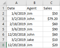
Our data above has the headers of Date, Agent, and Sales so Excel will know what to define the dates, names, and dollars under once the pivot begins. Let’s build!
Within Excel, click the Insert Tab → Pivot Table. This will automatically grab the data on the worksheet and offer to create a pivot table.
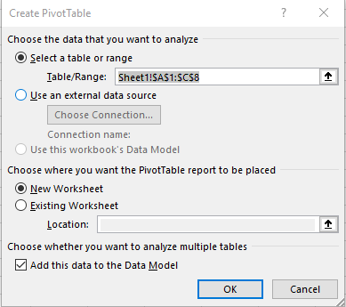
As shown, Excel defaults to creating a new table and on a new worksheet and adds data to the data model for the Pivot Table. Typically you won’t need to play with any settings here and instead just click OK to continue. You’ve now created a basic Pivot Table, but let’s check out the settings.
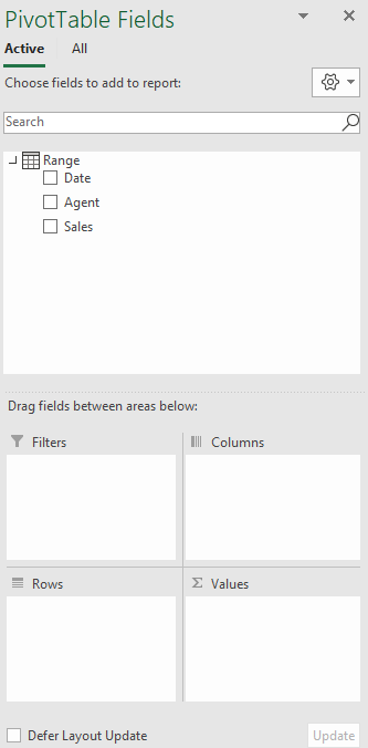
Every good pivot tabler knows though the real driving force of a table are its fields. Remember earlier how we ensured that we added Date, Agent, and Sales as column headers? Well, those have now become our pivot table fields. These fields can be placed into the bottom to create a dynamic cross section that can be used for all sorts of examination.
Interactive Maps Made Easy
Sign Up NowStart by clicking the checkbox next to each field. Excel will auto-assign the field to what it believes is the best corresponding section. Sometimes this is all you need to do but with more intensive data, you’ll want to adjust the data to match what you want to see. Here are a few examples of what the data will look like and their corresponding pivot table.
View Sales by Agent and Date
Default settings after clicking each of our boxes puts the Date in the Columns area, Agents in our Row area and Sum of Sales in our values area.
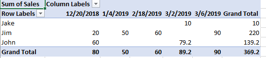
What we get is a run down of how each agent performed for each day listed and a grand total over the course of time within.
Filter by a Specific Agent
Sometimes you don’t want to see all the data, even when it’s summarized. Building off the previous example, we can actually filter by the agent and get a whole different view of the statistics.
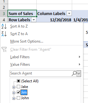
To see Jim’s totals for instance, you’d click the dropdown box on Row Labels → Uncheck Select All → Check Jim → then Click OK.
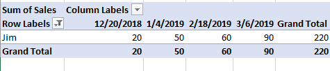
Oh look! A brand new analysis showing only Jim’s totals and dates so now we know how well Jim performed based on our original data.
View Sales by Date (with Agent Breakdown)
Perhaps we’re more interested in how well sales did per day in our data. Unfilter the previous example and swap the Date and Agent field from their spot in Columns to Rows and vice versa.
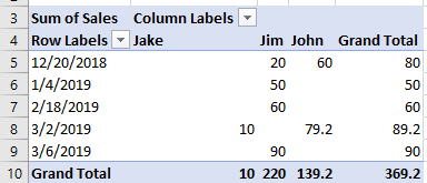
Now we have a nice analysis of how our fictional company did for each date listed.
Pretty great right? Even more ways to view the data can be done by stacking the Date field below the Agent field in the Rows area or vice versa. Play around with how you’d like it to look and what makes sense to you and you’ll be analyzing data in no time!
Format the Data in Your Pivot Table
You may have noticed there’s something a little off about our pivot examples. Each and every time we’ve changed it, our actual values seem to be lacking a little something: the dollar sign!
Every field within the Values area of a Pivot Table can be customized in various ways. With our default settings, we have Sum of Sales, but we can change that however we’d like. To edit a field within the Values area, click the drop down on the field and then click Value Field Settings.
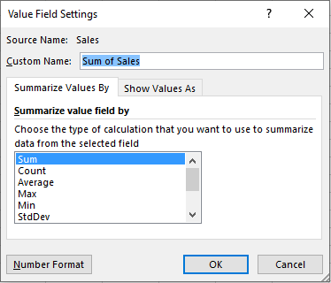
From here, we have a few excellent options to really display your sales data in a different way.
To change our numbers to have dollar symbols, we would start from Value Field Settings, then click Number Format. This next window should look extremely familiar as it is the same format field from everything else you do within Excel. If you choose either Currency or Accounting, we will now see our dollars back on display which makes things a whole lot clearer.
Create Advanced Pivot Tables
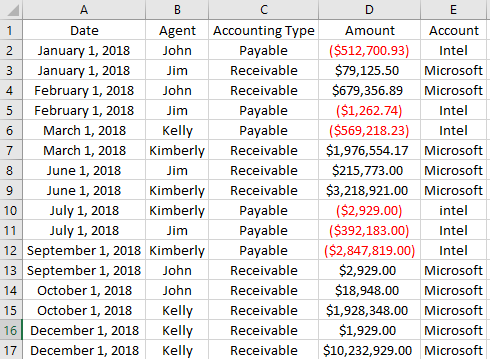
Once you have the basics of Pivot Table creation and field editing down, there’s so much more you can get into. Let’s take a look at one more example and get a little more intricate. You’ll apply your new Pivot Table skills, as well as some new tricks, to understand if Acme Incorporated made or lost money in 2018.
Here’s our sample data:
Let’s start by first making a Pivot Table using our data.
For this Pivot Table, let’s walk through our process to intelligently see if we made profit in 2018. For this example, we’ll be creating a pivot table that displays each agent’s name in the rows, adds the accounting type in the columns, provides a grand total in dollars for all and also is filterable by date and account.
- Add the Date and Account fields to the Filter Area. Order doesn’t matter as they are filtered independently.
- Add the Accounting Type field to the Columns area.
- Add the Agent Field to the Rows Area
- Add the Amount field to the Values field
Interactive Maps Made Easy
Sign Up NowNow use your formatting prowess to display the numbers: edit the amount field number format to be Currency and check the option to display negative numbers in read and parenthesis.
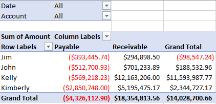
And voila! These changes now provide a powerful analysis covering a full year’s worth of data in a matter of seconds and mouse clicks. 2018 proved profitable for Acme Incorporated with 14 million in profit and the most profitable agent being Kelly.
This is just the cusp of what can be done with Pivots, but this knowledge alone will get you super far with your data analysis. Real quick, we’ll outline a few more advanced tricks you can use to make your data analysis with Pivot Tables work even better.
Replace empty cells or error values in data with 0s
- With a cell in your pivot table selected, navigate to the contextual PivotTable Tools ribbon and click on the Analyze tab then options on the far left.
- Within this new menu, locate the Format section
- You can put a check into either For error values show: or For empty cells show: and then add the value 0 into the input box.
- What this will do is add a value into those places where your base data may have errors and allow it to compute correctly regardless of if someone botched the actual entry before. This saves countless time and if something doesn’t add up, now you can look for 0s within the Pivot Table and head back to the core data to fix it.
Refresh Pivot Table Data whenever you open the workbook
- Click Options from the left side of the Analyze tab under the contextual PivotTable Tools ribbon.
- Click the Data Tab then check Refresh Data when opening the file.
- This will ensure your pivot table data will always update depending on what is in your base data saving you LOTS of time.
Add a slicer
Once of a data analyst’s favorites, adding a slicer to a pivot table gives a clean way to filter the data and is very intuitive for someone who has never touched a pivot. In other words, you can share your Excel document with someone else and let them click a few buttons to see some numbers and start data analyzing with the best of them.
- To add a slicer, Click the Analyze tab under the contextual PivotTable Tools ribbon. Next, select Filter → Insert Slicer
- Next, you can pick exactly what you’d like to filter by and as you click each option, it will auto sort the data in your table to match!
- To clear the slicer, click the filter with a red x in the top right corner and your data will turn right back.
- Another great way to use a slicer is to have one for each filter you’d like to see. For example, we could make one for an agent, accounting type, and account then drill down depending on what we click on each slicer!
Perform Geographic Data Analysis with a Map
Pivot Tables are great ways to analyze data within Excel. If you have geographic data, such as addresses or cities, you’ll want to display it on a map. BatchGeo can help you visualize location data.
For example, you can take sales data by location from Excel and display it in a clustered map.
View Household income, average clustering in a full screen map
Or filter by specific groups of data, choosing which to include or remove from the map.
View Graduation Rates vs Incarceration Rates in a full screen map
Create Your First Map for Free
Use the Excel mapping tool to copy-paste your data from your spreadsheet directly to a map, no coding necessary.