Change the Google Maps Marker Color (And More) to Match Your Content
Maps display the geographic location of your data on the world. But most aren’t made up of random information jumbled together. There’s often a topic or theme to the data within. Whether the topic is about the Olympics or has a Valentine’s Day theme, you can be sure you continue your map’s cohesive narrative by customizing the Google Maps icon, also known as the map marker, that symbolizes the locations below. This can be done in three ways, via the color, shape, and label of your map marker.
View Largest Wildfires of the Last Decade in a full screen map
So, once you’ve prepared your data for a map, you can begin making your map markers match your content by using shapes and labels. But first, let’s explore how color can create a cohesive narrative.
Create Cohesive Narratives with Color
Say you’re mapping a topic and it’s clear which of two options is good and which is bad. Wouldn’t it be fitting to change Google Map marker color to green for the preferred data and red for the not-so-good? There are many similar cases in which your marker color can help in conveying your data. Check out just one example on our map of working vs. broken McDonald’s ice cream machines below.
View McBroken Los Angeles in a full screen map
Another example of telling a story via a well-thought-out Google Map marker color is selecting yellow, light blue, and orange (to represent gold, silver, and bronze) for a map about every country’s Olympic wins and losses.
View Every Country’s Olympic Wins in a full screen map
And when mapping Valentine’s Day Town Names, it makes sense to use red and pink markers. But for a topic that doesn’t have a natural color association like our examples above, picking the colors of the rainbow will always be pleasing to you and your map’ users’ eyes.
BatchGeo gives you control over the story you tell with your location data, right down to how they’re styled. See all of your marker color choices when you edit your map and click Set Options. Then, Show Advanced Options to check them out. But color customization isn’t the only way to match your content to your map’s style.
Interactive Maps Made Easy
Sign Up NowShape Your Map Marker
As with carefully curated colors, the shape of your markers can also hold meaning. While the default Google Maps pin icons might be your go-to option, don’t forget you can mix it up to suit your mapping needs.
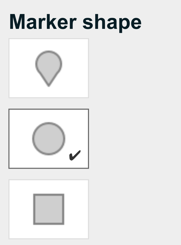
For our map of CCTV Cameras by City, we wanted to nix the destination-feel of the pin marker. The rule of thumb is: if it’s not important to pinpoint the exact location on the map, use a marker shape other than the pin. This most often applies to maps of cities, states, or countries.
View CCTV Cameras by City in a full screen map
To change your marker shape when editing your BatchGeo map, scroll to Set Options, Show Advanced Options, and navigate to Marker shape. Square map markers also have their uses and both are better than pins for displaying a marker label.
Identify At A Glance With Labels
A great map marker can only improve your map. And our final tip for getting these great markers involves labels. Best suited for maps with fewer markers, labels enable users to view how many markers there are at a glance.
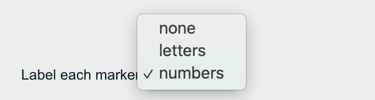
Plus, as in our map of the 23 largest wildfires, we can quickly determine the largest fire (1) down to the smallest (23) thanks to the numbered labels. Letter labels work the same way.
View Largest Wildfires of the Last Decade in a full screen map
Here’s where to find the label option in BatchGeo. Click Edit Map, then Set Options > Show Advanced Options. To the right of the Advanced options menu, next to “Label each marker” choose between none, letters, and numbers. Once you’ve selected, opt to Map Your Data near the bottom of the page.
Master the three ways of making your map markers match your content: color, shape, and label with BatchGeo.