Implement Project Tracking with Excel
From never-ending email updates to last-minute finishing touches on an overdue project, you have plenty on your plate at work. No matter how you currently manage it all, Excel can be a helpful addition to your project management tool kit. The popular spreadsheet software can help keep track of important dates and which members of your team are doing what.
Be it for a one-off project or an entirely new system for your processes, let’s take a look at two of the ways Excel can help you with project tracking: a timeline for projects and a chart to visualize it all.
Excel Project Tracker
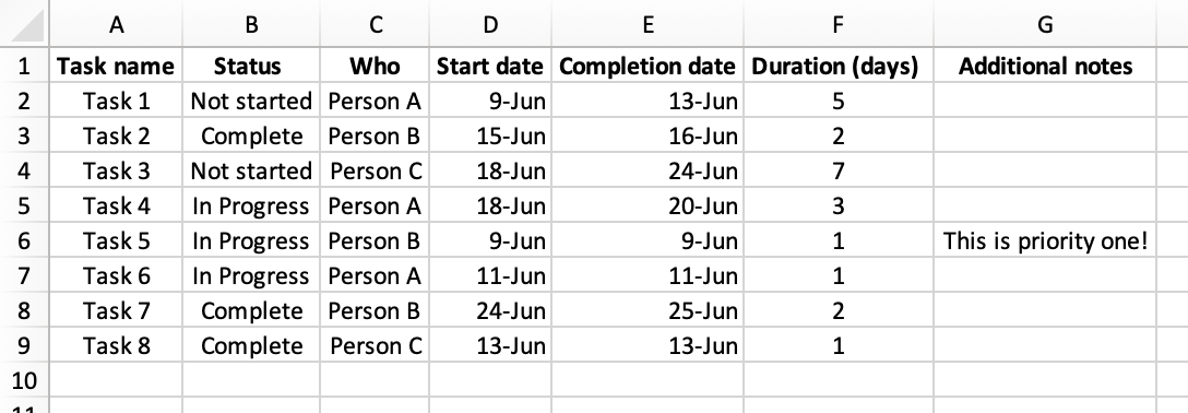
Keeping track of key dates and how long it will take to accomplish each task in a larger project is essential to ensuring it goes off without a hitch. This kind of project tracking comes easy to Excel—just start by creating appropriate column headers and then fill in the details.
Some suggested headings include:
- Task name
- Status
- Who it’s assigned to
- Start date
- Completion date
- Duration
- Additional notes or comments
These headings can be as granular or big picture as you’d like. For example, some might opt for separate Internal due date and External/client due date columns. Once you choose the headings specific to your project and fill in the details, you’ve got yourself a fool-proof way of tracking your projects. However, you may wish to turn this into a more visually-pleasing way of looking at your project’s steps, as we’ll show below.
Make a PM Gantt Chart in Excel
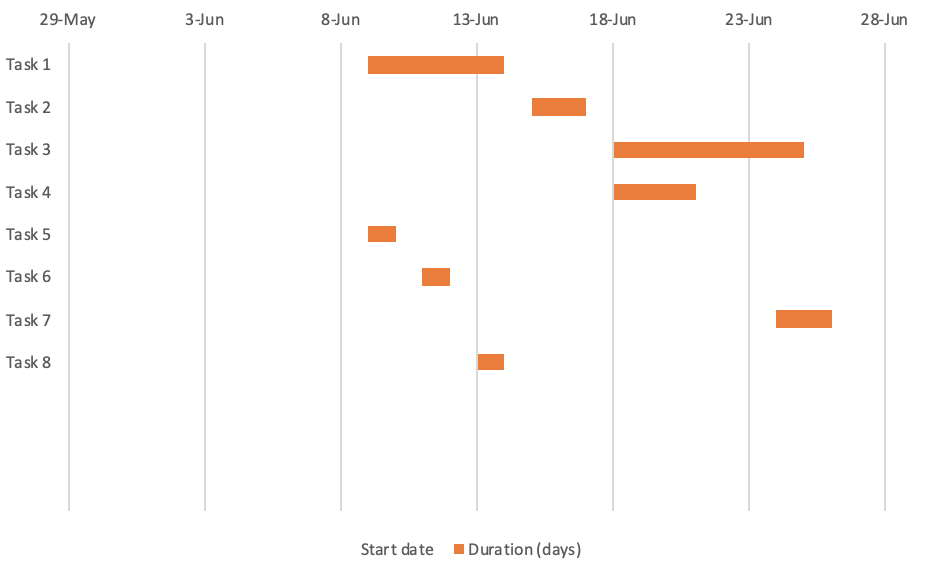
Another way to communicate project management data? Make it visual with the help of a chart. Gantt charts are a popular option for project management purposes as they offer an easy way to schedule and track your progress. And what better place to create a chart than the same tool you use for project management? While Excel doesn’t include Gantts as a chart type, you can make one of your project tracking data with a customized Stacked Bar chart.

To start, open your Excel project tracking spreadsheet and ensure you have (or add!) separate data columns for task name and either:
Interactive Maps Made Easy
Sign Up Now- Start date and Duration OR
- Number of days since start date and number of days until the task is completed
Then, select only those data columns and follow the steps below.
- Navigate to Insert → Bar Chart → Stacked Bar
- Remove the Start dates’ fill by right-clicking the blue bars → Format Data Series… → Fill → No Fill
- Since we want the first task at the top, let’s check the box for Categories in reverse order
- Optional: delete the title and/or legend by clicking → Delete
The result is a beautifully formatted chart that shows your progress. Note that you can customize the colors of your chart and even save it as a template for future Gantts. But charts aren’t the only way to visualize your business data.
More Ways to Make Excel Work for Your Projects
Project management is important for any successful venture and an Excel spreadsheet is a cheap and effective place for your data. See more ways to use Excel as a PM tool. However, it’s not the only useful thing for which you can use Excel.
If your spreadsheet contains location data such as addresses, cities, states, or countries, you can also map out your data. Maps provide visual insights you may otherwise miss. Get a feel for where the majority of your markers (data points) are located, sort, group, etc. One such example applies if you send out quotes or estimates on behalf of your business. If so, you can create a proposal tracking map.
View Proposal Tracking Map in a full screen map
Your success counts on improving the percentage of proposals that are accepted, keep track of where in the world or region your proposals go, where they are most accepted, and how potential clients heard about your business. So the ability to sort by “Proposal Status” or “How They Heard About Us” is invaluable. See what you can gain from making a similar map for your business at batchgeo.com.