How to Add Inline Charts to Your Maps

Maps tell a story, taking flat data and adding the dimension of location. Similarly, charts and graphs often show data over time. Wouldn’t it be great to blend these together? In this post, we’ll show you how.

View Sales Map for Inline Charts in a full screen map

Take the examples above, two ways of showing customer data. First, the map shows the locations of your top ten customers by sales volume. On the right, you see the same ten, displayed by sales per month over the last year. Each is showing some data that the other isn’t.

Now, consider this merged map:

View Sales Map for Inline Charts with Charts in a full screen map

You can peruse the underlying map data by selecting a field in the lower left. You can see the total sales, for example, to determine which locations are higher than others. Click on each location, and you’ll see the actual sales chart for this location over the last 12 months.

In a single map, you can quickly get the full story, more than is communicated even with the map and chart combined. Let’s walk through how this map was built, and how you can make one with your own data.

Decide Which Data to Display on Your Map

To create a map, the only data you actually need is a set of locations. Technically, a location is described with latitude and longitude coordinates. In practice, an address, postal code, or region name is sufficient. BatchGeo will perform the geocoding to convert location descriptions into coordinates. In addition, any other data you have can be grouped and filtered. Some of this additional data will be what you’ll include in the chart in the next step.

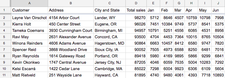
Let’s stick with the sales example above. The sales data and locations of the 10 customers is probably stored in a spreadsheet. You might have a column for the customer name, address, city, total sales, and sales for each of the last 12 months.

You could put all of this on your map, but only if you expect you’ll want to look at the top customer in June, then turn around and find the top customer in October. More likely, you’re looking for summary data and sales growth. One useful approach could be to calculate the growth rate from the first month through the last month as its own column. Whatever fields you choose to include in your map, keep in mind each one will extend the information box when viewing an individual location. Also, the chart in the next section should provide a much easier view of the monthly data.

Note on growth rates: If seasonality could be a factor, you could make sure you have at least 13 months worth of data, so you’re comparing to the same month the year previous.

Let’s say you’ve decided to only show the annual total for each customer. Don’t start deleting data from your spreadsheet. Instead, create a new sheet in the same workbook, or even create new columns to the right of your source data. These new columns will be the ones you use to create your map, so they need to be all together for easy copying. You can use cell references so that if you ever update one set of data, it updates the other.

Generate Chart Image URLs

When we decided what data to include along with the map, we eliminated the individual month data. We want to revive that useful data where it is displayed best: in a simple line chart. By creating chart images for each customer, we can embed it into the information box of each map location.

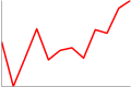
Many charts have a lot of extra labels, a legend, title, and more. Those are important when displaying a chart on its own, because it gives the viewer some context. In this case, we’ll be displaying it alongside other data, so we want to streamline what is displayed. You can play around with creating these charts using this tool. By doing that, I came up with this streamlined chart:

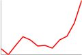
Here we can see simply the change in sales for one customer over 12 months. Now we want to generate those URLs for each of our customers. We can do this dynamically, by inserting our data into the "chd=t:” section of the URL. There’s one thing that makes those chart numbers a little tougher: we need to scale them so each number is between 0 and 100. Since we’re generating this URL in a spreadsheet, that should be fairly each with one gigantic sequence of formulas.

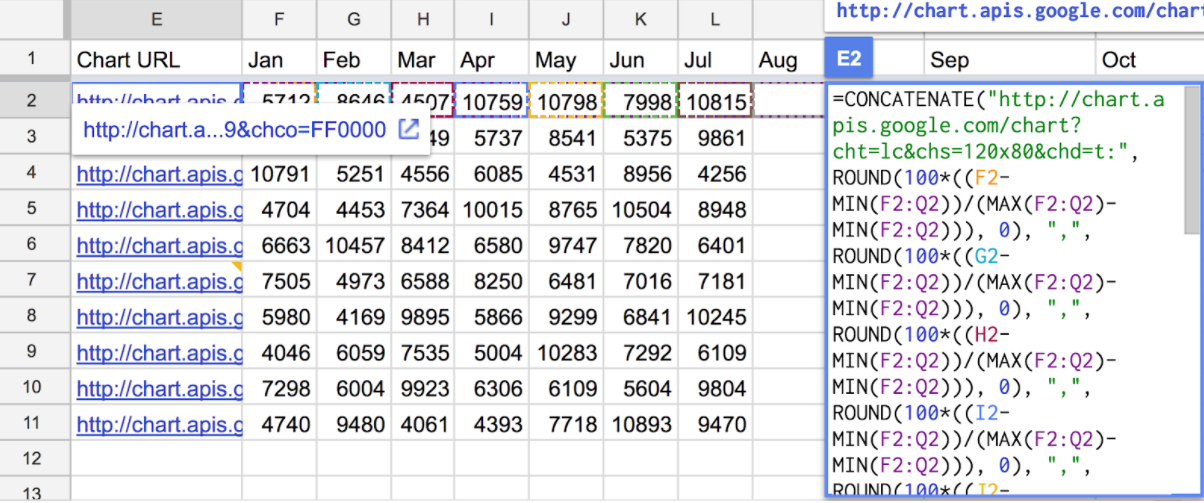
The formula will calculate where each month lies on the scale based on the lowest month being 0 and the highest month being 100. For example, in my spreadsheet the 12 months are columns E (January) to P (December). To find March’s scaled value for the customer in row 2, we use this formula:
=ROUND(100*((G2-MIN(E2:P2))/(MAX(E2:P2)-MIN(E2:P2))), 0)

The result is 17, because March’s $1,401 is closer to the lowest month ($1,190) than the highest ($2,423).

Now we repeat that for each month. Everything above stays the same except the “G2” becomes the column for the appropriate month. We’ll then use CONCATENATE to insert the values into the chart URL. Here’s the complete formula:


=CONCATENATE("http://chart.apis.google.com/chart?cht=lc&chs=120x80&chd=t:", ROUND(100*((E2-MIN(E2:P2))/(MAX(E2:P2)-MIN(E2:P2))), 0), ",", ROUND(100*((F2-MIN(E2:P2))/(MAX(E2:P2)-MIN(E2:P2))), 0), ",", ROUND(100*((G2-MIN(E2:P2))/(MAX(E2:P2)-MIN(E2:P2))), 0), ",", ROUND(100*((H2-MIN(E2:P2))/(MAX(E2:P2)-MIN(E2:P2))), 0), ",", ROUND(100*((I2-MIN(E2:P2))/(MAX(E2:P2)-MIN(E2:P2))), 0), ",", ROUND(100*((J2-MIN(E2:P2))/(MAX(E2:P2)-MIN(E2:P2))), 0), ",", ROUND(100*((K2-MIN(E2:P2))/(MAX(E2:P2)-MIN(E2:P2))), 0), ",", ROUND(100*((L2-MIN(E2:P2))/(MAX(E2:P2)-MIN(E2:P2))), 0), ",", ROUND(100*((M2-MIN(E2:P2))/(MAX(E2:P2)-MIN(E2:P2))), 0), ",", ROUND(100*((N2-MIN(E2:P2))/(MAX(E2:P2)-MIN(E2:P2))), 0), ",", ROUND(100*((O2-MIN(E2:P2))/(MAX(E2:P2)-MIN(E2:P2))), 0), ",", ROUND(100*((P2-MIN(E2:P2))/(MAX(E2:P2)-MIN(E2:P2))), 0), "&chco=FF0000")

That looks mighty complicated, but keep in mind what we’re doing here is to fill in the 12 scaled values to make that chart URL. Excel formulas aren’t known for their brevity, but they get the job done.

Put Them All Together

You can use spreadsheet magic to copy the giant formula we created for one customer to all the other customers. The row references in your spreadsheet (E2, F2, etc) should update as you paste (E3, F3, etc). When you have chart images for all the customers, we’re finally ready to make our map.

Using our map making tool, copy and paste all the data you want as part of your map. Be sure to include the header row, the location column, as well as the chart column.

  1. Paste all the data into the map tool box
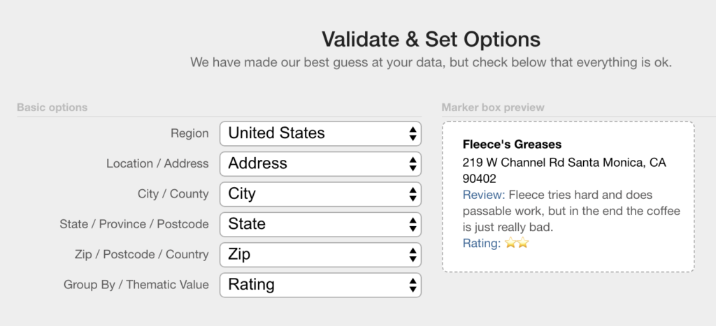
  2. Click Validate & Set Options
  3. Double check that BatchGeo is using the right columns for the address, city, etc.
  4. Click Show Advanced Options
  5. For Image URL, choose your chart URL column
  6. Click Make Map!

Now check out your map, complete with inline chart!

View Sales Map for Inline Charts with Charts in a full screen map

Click any of the customer markers and you’ll see the data we selected, as well as the chart embedded right there.

You now have a customer map (or whatever data you’ve used) with the data available for filtering, as well as the time series data in an inline chart. Packed into your single map are the many stories in your data.

Create your map now!

Mapping the Appalachian Trail: Landmarks and Milestones

As the longest hiking-only trail in the world, the Appalachian Trail follows along the ridge of the Appalachian Mountains and traverses 2,200 miles, 14 states, and five national parks. Each year thousands of people attempt to hike those 2,200 miles, but only one in four hikers make it all the way from Georgia to Maine. While can take between five to seven months to hike the entirety of the trail, more than two million people each year hike at least some part of the Appalachian Trail. Those two million people sure find hiking the Appalachian Trail enjoyable, and with over 200 landmarks and milestones along the trail, there is little reason to wonder why. There nothing boring about hiking – or mapping – the Appalachian Trail.

View Appalachian Trail Map in a full screen map

Experience the landmarks and milestones of the trail for yourself on the map above, or read on for insights we found here on hiking the Appalachian Trail.

Peaks

You can sort the map by the types of landmarks or milestones you may encounter along the trail. Peaks are hard to miss milestones, and the Appalachian Trail boasts some tall ones. Luckily, or maybe not so much for thru-hikers, the two trailheads at the start and finish of the Appalachian Trail are peaks, and they are pretty tall.

Trailhead: Springer Mountain

Photo Courtesy of Atlanta Trails

At 3,782 feet, Springer Mountain in Georgia is the most popular place to begin the thru-hike on the Appalachian Trail. However, because Springer Mountain is the most popular place to start, it also means that between March 1 and April 15th, the recommended starting season for the hike, the trailhead is usually packed with other hikers also beginning their trek.

Trailhead: Mount Katahdin

Photo Courtesy of Wikipedia

Located at the other end of the Appalachian Trail in Maine is Mount Katahdin. At 5,268 feet, this mountain is even taller than Springer Mountain. The peak marks the end of the Appalachian Trail for most hikers. Fittingly, Mount Katahdin is regarded as the most difficult mountain to hike throughout the Appalachian Trail. Most hikers prefer to save it for last rather than begin the trail here.

Highest Peak

Photo Courtesy of Kristina Plaas on National Park Service

The highest peak on the Appalachian Trail is Clingmans Dome. This peak is about 200 miles into the thru-hike starting in Georgia, or about 2,000 miles from the end of the trail in Maine. The peak is located in the Great Smoky Mountains of Tennessee and North Carolina and is 6,643 feet. It is the highest mountain in the Smokies and the highest point in Tennessee. Clingmans Dome is also the third highest point in Eastern North America!

Lowest Peak


Photo Courtesy of the New York State Parks, Recreation & Historic Preservation

On the other hand, the lowest peak on the Appalachian Trail is Bear Mountain Zoo. Closer to the end of the trail in New York, this landmark is only 124 feet above sea level. More than just a zoo, Bear Mountain State Park has many amenities for those hiking the Appalachian Trail or for those just visiting the State Park. Things to do while here include picnicking, fishing, swimming in the swimming pool, visiting the museum or zoo, hiking, biking, cross-country skiing, and ice-skating from late October to mid-March. There is also a Memorial Tower which rests atop Bear Mountain that gives you views of the entire State Park.

Lodging

While many hikers make their way along the Appalachian Trail with only tents to stay in, the trail also has over 35 comfortable lodging accommodations for those who want a more luxurious hiking experience. There are six different types of lodging accommodations along the Appalachian trail: donation-based hostels, churches, shared bathrooms, private rooms, guest houses, and hotels. More than just a place to stay, these lodgings also provide a variety of services that range from shuttles, laundry, kitchen facilities, and showers, to grocery items, supplies, and provided meals.

  • Donation-based hostels – Donation-based hostels are just that: donation-based. There are eight of these along the Appalachian Trail, and there is no obligation to pay for your stay, although donations are happily accepted and can be anonymous.
  • Churches – There are three hostels housed and operated out of churches along the Appalachian Trail.
  • Shared Bathrooms – In the one hostel with shared bathrooms along the trail, you’ll get a room to yourself, but you may run into other hikers in the hall on your way to the shared bathrooms. However, after a solo day of thru-hiking, some small talk in the hall might be just the thing you need.
  • Private Rooms – Hostels that have private rooms provide some R&R you may miss out on if you find yourself staying in another type of hostel. They are in no short supply, as there are 20 hostels along the Appalachian Trail that have private rooms.
  • Guest Houses – The two guest houses on our list sound pretty accommodating. Sutton’s Place, located in Manchester, Vermont, has been hosted by Frank Sutton for over 30 years. Sutton’s Place actually has 4 guest rooms available in the guest house, ranging from a price of $75-$99. The second guest house option, the North Woodstock Guesthouse, is located in North Woodstock, New Hampshire, and is hosted by Christine for $40 per night.
  • Hotels – There are two non-hostel hotels located along the Appalachian Trail if you’re hoping for more of a deluxe accommodation. Both the Fontanna Village Resort and The Doyle Hotel have cozy rooms available for hikers.

Post Offices

Hiking 2,200 miles over the course of 5 to 7 months can be hard, to say the least. While the Appalachian Trail touts hiker hospitality, planning mail drops or bounce boxes may come in handy in case of sickness, really sore feet, or a craving for gummy worms. Whether you pre-send yourself packages filled with essentials before you begin the trail or you’re writing to someone and telling them the next post office destination, the Appalachian Trail is home to over 100 post offices for your use. An important note: the first post office is located 20 miles from the start of the trail, so bring enough essentials to get you through those first 20 miles.


If you’re not ready to hike the trail yet, we understand. You can always make your own trail map today! Also, keep an eye out for our post on hiking highlights of the Pacific Crest Trail, which is 500 miles longer than the Appalachian Trail.

Make a Map with Clickable Pop-up Infowindows and Images

Give your website, event, or blog post the impact it deserves with an interactive location map. Readers can make much more sense of geography when it’s plotted visually. Think through your own experiences navigating a festival, a tour, or just across town. It’s just easier to understand how places relate to one another when you can see them spatially.

View Santa Monica Mechanics (Location Names) in a full screen map

The good news is it’s easier than ever to be able to create these maps. In this tutorial we’ll create one like above, complete with clickable markers that show infowindow boxes and even have custom images inside.

Include a Description and Other Text in Your Pop-up

The easiest way to get started is to use an Excel spreadsheet (Numbers, Google Sheets, and others work, too) containing all of your locations. You can use separate columns for parts of the address, or include everything in one. The geocoding technology will figure out what you mean.

Let’s say you operate a website about Santa Monica mechanics. You might have them listed in your spreadsheet like this:

Name Address City State Zip
Fleece’s Greases 219 W Channel Rd Santa Monica CA 90402
Roseland Automotive 445 Palisades Beach Rd Santa Monica CA 90402
Adali Cata Car Care 250 Santa Monica Pier Santa Monica CA 90401
Callat the Mechanic 1517 Lincoln Blvd Santa Monica CA 90401

If you copy and paste that into our mapping tool, you’ll have a custom map without any other input. It’s almost magic.

View Santa Monica Mechanics (Location Names) in a full screen map

What if you want more information besides the shop’s name in the infowindow? Easy! Just add more columns to your spreadsheet. For example, let’s say you had written a short review and gave a rating to each mechanic. So far you’ve kept your genius in a spreadsheet. Let’s share it with the world!

Name Address City State Zip Review Rating
Fleece’s Greases 219 W Channel Rd Santa Monica CA 90402 Fleece tries hard and does passable work, but in the end, the coffee is just really bad. ⭐⭐
Roseland Automotive 445 Palisades Beach Rd Santa Monica CA 90402 Keeps a clean shop, but the waiting room has magazines that haven’t been published in 20 years. ⭐⭐
Adali Cata Car Care 250 Santa Monica Pier Santa Monica CA 90401 Fantastic work! Free WiFi and a barista on staff! ⭐⭐⭐⭐⭐
Callat the Mechanic 1517 Lincoln Blvd Santa Monica CA 90401 Cheap, good, or fast. They always make me choose two. ⭐⭐⭐

Copy and paste that data here and then choose “Validate and Set Options.” This gives you a list of settings that you can change.

You also can preview how the infowindow will look. Advanced Options show even more ways to determine how your map and locations work. In this example, I’ve stuck with what was pre-chosen, except that I want to group by ratings. I got fancy and made the ratings actual stars using emoji, but this could be a letter grade, a decimal number, or anything you want. The map will adjust its grouping settings accordingly.

View Santa Monica Mechanics (with Ratings) in a full screen map

Now readers can click the markers as they browse the map, or use the legend at the bottom to filter what they see. The colors of the markers are also determined by what group they’re part of, which allows for a quick visual indicator of data within the map. This becomes more apparent when there are hundreds or even thousands of markers.

Go ahead and play around with this to get your custom interactive map working the way you want. When you add additional columns to your spreadsheet, they become part of the info window description. Many of these will also be added as grouping options, if you’ve enabled the feature.

Add Images to Your Pop-up

An image is worth 1,000 words—and now you can get your maps there in a single click. Include logos, icons, photos, or other imagery in your infowindow box. Adding additional visuals to your maps can make them appear even more customized and useful.

Let’s go with one more example spreadsheet:

Name Address City State Zip Image
Fleece’s Greases 219 W Channel Rd Santa Monica CA 90402
Roseland Automotive 445 Palisades Beach Rd Santa Monica CA 90402
Adali Cata Car Care 250 Santa Monica Pier Santa Monica CA 90401
Callat the Mechanic 1517 Lincoln Blvd Santa Monica CA 90401

Copy and paste that into the map generator and you’ll see that each marker’s infowindow now includes an icon!

View Santa Monica Mechanics (With Images) in a full screen map

You can include a single small image with every location on your map. Two important things to keep in mind here are:

  1. Size: you want to keep it small, not more than 150 pixels in either direction.
  2. Hosting: you need to upload your image somewhere, such as a blog or image provider.

Find the URL for every image and include that in your data, as I did with the mechanic icons above. Then you can select the spreadsheet column in the advanced settings, or BatchGeo will discover it automatically with a name like “Image."

Add StreetView to Your Pop-up

One final type of imagery you can use is StreetView. These are pictures gathered by Google’s many 360 degree cameras driving all over the world. If there is a StreetView image available, we can include a thumbnail in the marker’s infowindow. Need a bigger view? Just click the image and you don’t even need to leave the map to see the location expanded.

StreetView is only available with BatchGeo Pro. Make maps with more locations, faster geocoding, and advanced features. Find out more today.