Life Expectancy in China, Japan & 180+ Other Countries
There are billions of people on the planet, all with varying quality of healthcare, economic circumstances, diet and exercise regimes, and genetic predispositions. Even with all these factors, biologists have been estimating the average life expectancy of human beings for centuries. While it’s generally increased, thanks to advancements in medicine and technology and a growing understanding of how to lead a healthy lifestyle, your life expectancy still differs depending on your country.
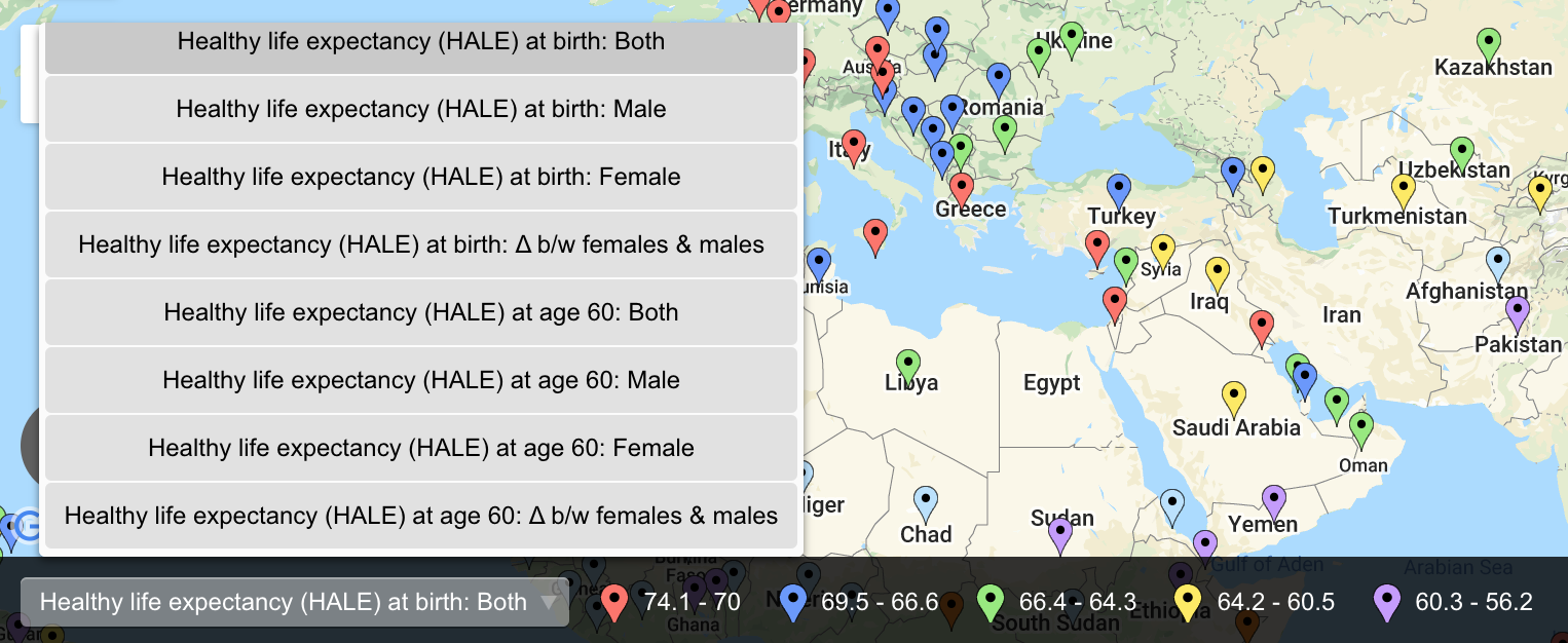
We’ll examine the average life expectancy of 183 countries, including the differences between males and females in each location. We’ll also look at which countries have seen the largest change (be that an increase or decrease in life expectancy) in recent years on the map below.
View Country by Country Life Expectancy in a full screen map
The map contains the World Health Organization’s 2019 data via Wikipedia. Multiple ways of sorting the map include various things (male, female, both, and changes) of the following four things: life expectancy at birth and at age 60 along with Health-adjusted Life Expectancy (HALE) at birth and again at 60. Let’s begin with the life expectancy at birth of both sexes.
Japan Life Expectancy Is Best & 9 More Long-Living Countries
Each of the countries listed below has male and female life expectancies at birth over 82.5 years. One location’s average is as high as 84.3 years, though the median life expectancy of the top 10 is 83.15 years.
- Japan
- Switzerland
- South Korea
- Singapore (tied with Spain)
- Spain (tied with Singapore)
- Cyprus
- Australia (tied with Italy and Norway)
- Italy (tied with Australia and Norway)
- Norway (tied with Australia and Italy)
- Israel
As mentioned, the Japan life expectancy is the highest of the world’s 183 countries at 84.3 years. Many attribute the high life expectancy in Japan to a diet traditionally high in seafood and low in wheat. It’s no wonder the country also has one of the lowest rates of obesity.
Switzerland (83.4) and South Korea (83.3) are within 0.9-1 years of the life expectancy of Japan. Similarly, Singapore and Spain are tied with life expectancies of (83.2) while Cyprus’s is .1 less at 83.1. The life expectancy in Italy, Australia, and Norway is 83. Finally, Israel (82.6) rounds out the 10 countries with life expectancies above 82.5 years. You’ll note these 10 countries are distributed among four continents: five are in Europe, four in Asia, and, of course, Australia.
Interactive Maps Made Easy
Sign Up NowAs for countries that just missed the mark, the France life expectancy is 82.5 years, making it the 11th country with the highest life expectancy. Just below France, the Sweden life expectancy (tied with Luxembourg) is #12 at 82.4 years.
Surprisingly Low Life Expectancy Leaders
No country in either North or South America appears on the list of the 10 countries with the highest life expectancy. Canada is home to the longest living population in the either of Americas, though it’s still further down at #15.
If you’re wondering where world leaders like the United States and China stand, they’re surprisingly low. The U.S.’s average life expectancy is 78.5 years, making it #40. As for the life expectancy in China, the country falls even lower than the U.S. The China life expectancy is 77.4 years (#48). Let’s move on to a more positive metric, though life expectancy changes also contain a couple of negative stats.
Notable Changes in Life Expectancy
More than countries with the longest-living populations or those with shorter lifespans, quite a few places saw notable changes in their life expectancy. Occurring between 2000 and 2019, most are a positive increase, though it’s not the case for every country.
Places with Positive Increases
The 10 countries with the largest increases in life expectancy are all located in the various regions of Africa. This includes the following seven East African countries:
- Rwanda (+21.6 years)
- Malawi (+20.9)
- Burundi (+20)
- Ethiopia (+18.1)
- Zambia (+18)
- Uganda (+17.9)
- Tanzania (+14.8)
As of 2019, Rwanda’s new average life expectancy is 69.1 years. That of Malawi has risen to 65.6. The life expectancy of Burundi’s population has been updated to 63.8 years while Ethiopia’s stands at 68.7. Those who live in Zambia now have a life expectancy of 62.5 years, Uganda now equals 66.7, and Tanzania 67.3 years.
In addition to the seven countries in East Africa, three Southern Africa countries have seen a significant increase in their life expectancy. These include Botswana (+16.6 years), Zimbabwe (+14.1), and Angola (+13.8).
Locations with Less Life to Live
Now, changes in life expectancy aren’t all positive. Some countries’ life expectancies have actually gone down in recent years. Since 2000, the life expectancy of those who live in the Dominican Republic has decreased by -0.4 years to 72.8 years. Additionally, Venezuela has also seen a decrease in life expectancy since the beginning of the century (-0.2 years). The South American country’s current average is 73.9 years.
View Your Maps on Google Earth
We zeroed in on the life expectancy at birth estimation. However, there is also information on how long people live once they hit their 60s, along with healthy life expectancy. This is the average number of years that a person can expect to live in “full health” (and a more recently adapted estimation). Explore the map to learn more about these groups.
There’s a lot you can do with BatchGeo: group your additional data, embed maps to your website, and email them to friends. But there may be occasions when you need your maps in the format of another popular mapping tool. Instead of starting from scratch, you can export a KML file to view Your Maps in the likes of Google Earth, Google Maps, ArcMap.
To find out more about exporting KLM, visit our page on how to Generate Google Earth KML documents. Otherwise, get started making your own flexible maps at batchgeo.com.