Google Fusion Tables Alternative for Copy-Paste Maps
It’s the end of the line for Google Fusion Tables. The search giant announced that it will shut down its experimental data visualization tool. Since it first came out of Google Labs in 2009, people have used the service, which was a combination of spreadsheet and database, to store data, then display maps and charts that analyze the data.
The maps became an especially popular part of Google Fusion Tables, because geocoding was built-in. With a list of addresses in Fusion Tables, Google would automatically create geographic coordinates and plot them on a map. While you can get much of the charting from Google Spreadsheets, Excel, and other tabular tools, the maps are harder to replace. To make a map from your Fusion Tables data, you either learning to program the Google Maps API or look for a tool outside of Google.
We’ll show how you can replace your Google Fusion Tables maps with BatchGeo. It’s an easy import/export process to get even more powerful maps than Fusion Tables provided.
Export a Fusion Table to CSV
The first thing you need to do is find your Fusion Tables and decide on which one you want to turn into a map. We’ll need to export your Fusion Table to CSV–that’s a comma-separated value file, a format easy to open in spreadsheets and works nicely with lots of tools.
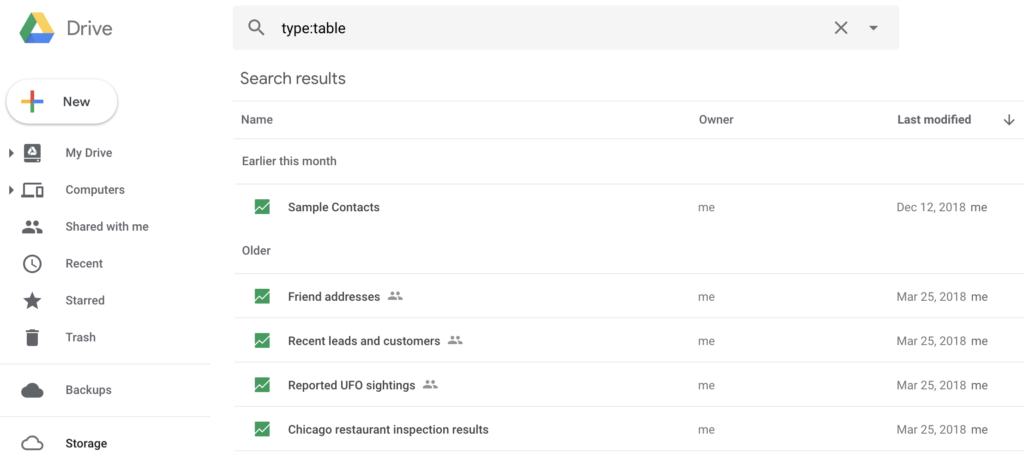
- Make sure you’re logged into your Google account, then list your Fusion Tables in Google Drive by searching for type:table.
- Double-click the Fusion Table you want to export to open it.
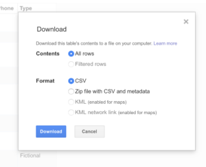
- Click the File menu, then select Download.

- Confirm the details and click Download again
The file should now download to your computer (or you should be prompted to choose a location). Once you find the CSV file on your computer, you’ve successfully exported your Google Fusion Table.
Now you can repeat the process with other tables you want to download. Before Google Fusion Tables is completely shut down, Google will create a way to download everything at once. In the meantime, we need to go one at a time.
Interactive Maps Made Easy
Sign Up NowChoose your favorite table and head to the next section to see how quickly you can turn it into a powerful map with BatchGeo.
Import a CSV Into a Map
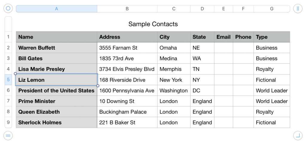
With your Fusion Table downloaded, you now have a CSV sitting on your hard drive, waiting to be turned into a map. If you want to look at the data or edit it, you can open the CSV file in Excel, Numbers, or any other spreadsheet program (including Google Spreadsheets!). You can also view it in an ordinary text file, though you’ll need to be careful, as the formatting is important to help maintain the columns and rows.
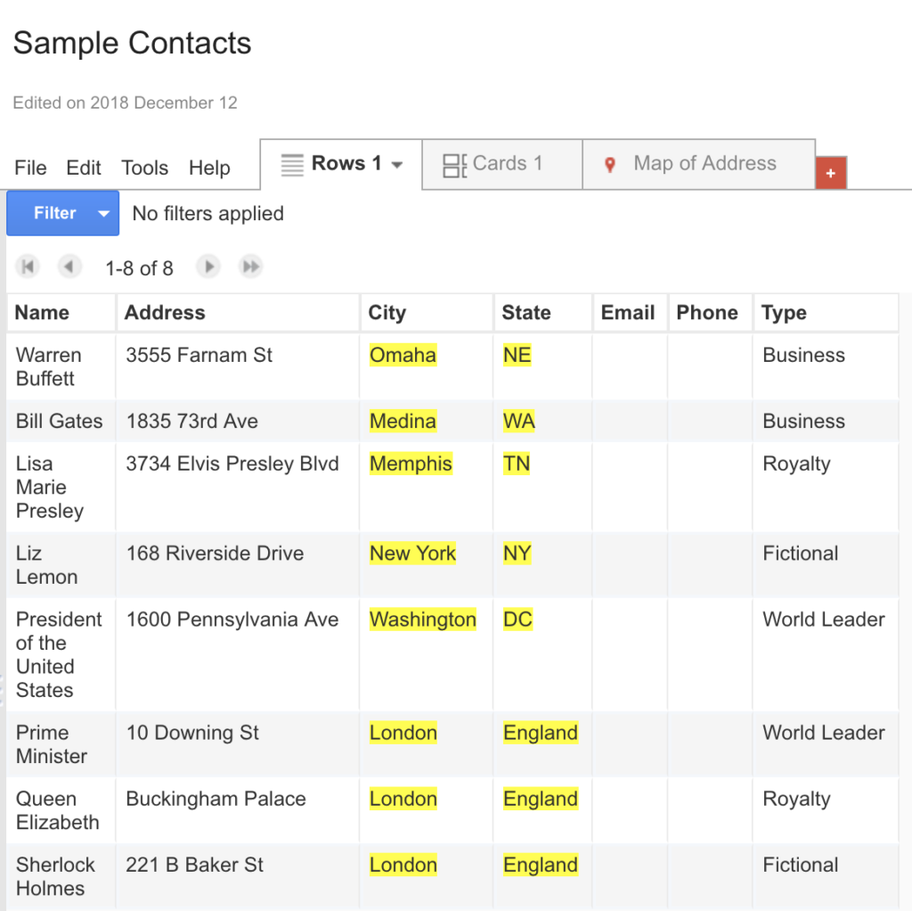
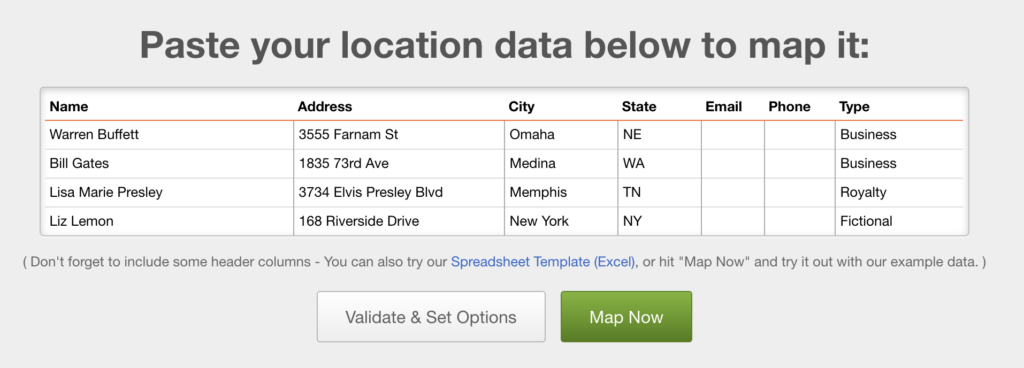
If you open up your CSV file in a spreadsheet program, you’ll see the headers and data from your Fusion Table:
Now simply follow these steps:
- Highlight and copy the entire spreadsheet, including the header row.
- Go to the BatchGeo homepage
- Click in the big box and paste your data.
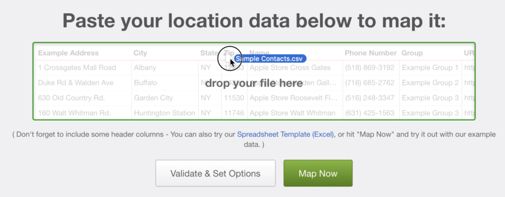
Now you’ll see your data within the big box on the BatchGeo home page. Click the “Map Now” button and see your data transformed into a map in seconds.
Alternatively, you can skip the step of opening the data in your spreadsheet. Simply drag the CSV file into the big box on the BatchGeo home page. We’ll do the importing for you!
Either way, you now have a map easily made from your Google Fusion Tables data. BatchGeo performs automatic geocoding of your addresses so they can be placed on a map.
Do More With Your Map
In addition to creating simple maps, BatchGeo also displays your non-geographic data automatically. You can click on markers to see details, or use some other features to get more information from your map.
View Google Fusion Tables Exported Map in a full screen map
If you have other columns within your data, such as categories or types, you’ll be able to use the map filtering and grouping technology within BatchGeo. In our example map, the color of the markers are determined by the different values in the “Type” column. You can click a label in the bottom of the map to see only the markers you want.
Another way to display additional data within the map itself is to enable map marker clustering, which will display high density markers with circles sized accordingly. In addition, you can pick a numeric column from your dataset and display the average or sum from that column for the area covered.
Now that you’ve transformed your Google Fusion Tables, there are countless other ways to bring your data to life, including BatchGeo Advanced Mode, available with Pro accounts.