Use an Excel Pivot Table to Count and Sum Values
So, you have data and you need a quick way to make sense of it. A PivotTable is a great option and it is one of Excel’s most powerful tools. We’ll walk you through what a PivotTable is, preparing your data for a PivotTable, quickly performing analytics using a PivotTable to Count and Sum your data, and finally, overlaying your PivotTable data onto a map using sum clustering.
What is a PivotTable?
First, let’s establish what a PivotTable is and what it can do. A PivotTable is a quick and easy tool within Excel that allows users to easily summarize data. Now, most regular tables have summary rows at the bottom such as a Sum to show the total sales of all products in all states or a Count of all of the entries included within the table.
However, a PivotTable takes those summaries a step further by allowing users to quickly answer more specific questions such as the total sales broken down by each product, state, or even city with just a few mouse clicks.
Preparing Your Data
Now that we know what a Pivot Table is and what it can do, the first step to create one is to prepare your data by organizing it into a single worksheet, preferably into a Defined Table.
Organizing Data into a Single Worksheet
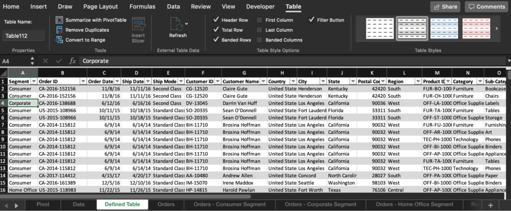
It’s common to have data stored in multiple places, like separate tabs for various time periods or products. In order to view all of this data within your PivotTable, you’ll need to combine it into a single worksheet. The simplest way to do this is to identify the difference between each data source and create a new corresponding column within your combined worksheet to store that differentiator. For example, perhaps a different salesperson manages each business segment resulting in a separate workbook for each segment as pictured below.
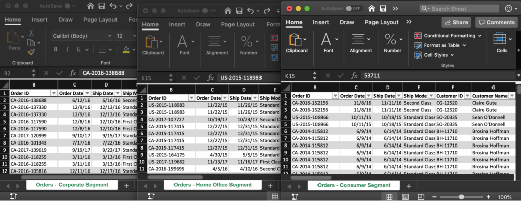
To combine this data, we can create a new column called “Segment” anywhere within the data set and populate the rows with the corresponding segment name as we copy and paste all the data into a single table.
Interactive Maps Made Easy
Sign Up Now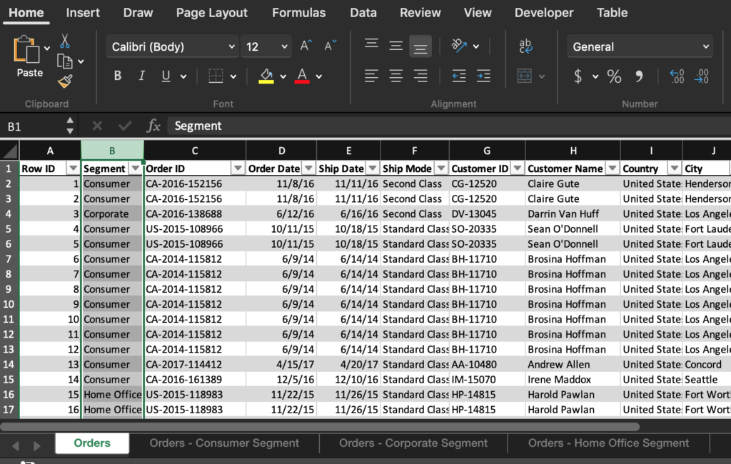
Pro Tip! – If your data already includes a date field, there is no need to add an additional column for the time period identifier. The date field can be used to break the data back out into the applicable time periods once we create our PivotTable.
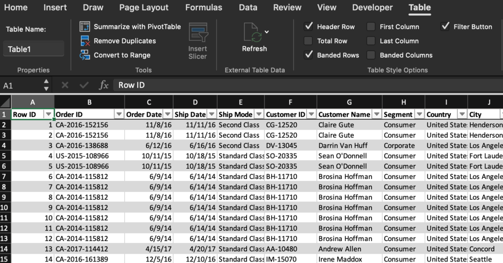
Creating a Defined Table
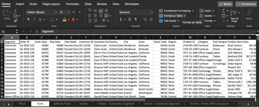
Now that you’ve organized your data into a single worksheet, you can save yourself time down the road by identifying the data as a Defined Table. Do this by clicking anywhere within your data and choosing the “Format as Table” option on the “Home” ribbon. A major advantage of creating a Defined Table upfront is that your PivotTable can be kept current over time even as the underlying data is updated. All you have to do is toggle the “Refresh Data” option within your PivotTable to pull in any new or modified data.
Create a PivotTable to Count
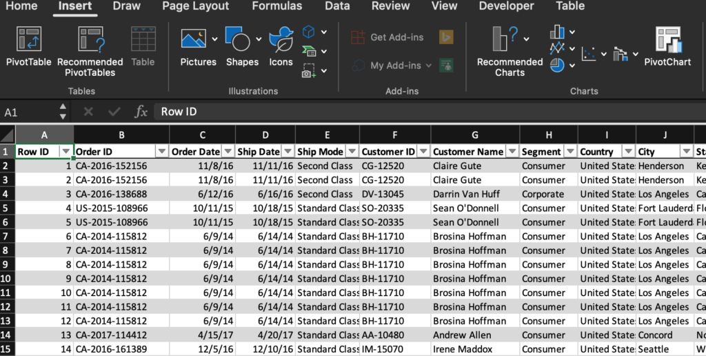
If your goal is to determine how many times a specific event occurred, such as how many distinct customers made a purchase or how many sales were generated within each city, a PivotTable configured to Count records is exactly what you need. To start, if you already have your data within a Defined Table, simply click anywhere on your table and choose “Summarize with PivotTable” from the “Table” ribbon.
Alternatively, if your data has not already been organized into a Defined Table, you can select your data manually by clicking the top leftmost cell within your dataset and then dragging down to the bottom rightmost cell. At this point, you can click “PivotTable” from the “Insert” ribbon.
From there you’ll be able to choose which data point you want to count by selecting the checkbox next to the data in the right-hand PivotTable Fields settings that automatically open when creating a new PivotTable.
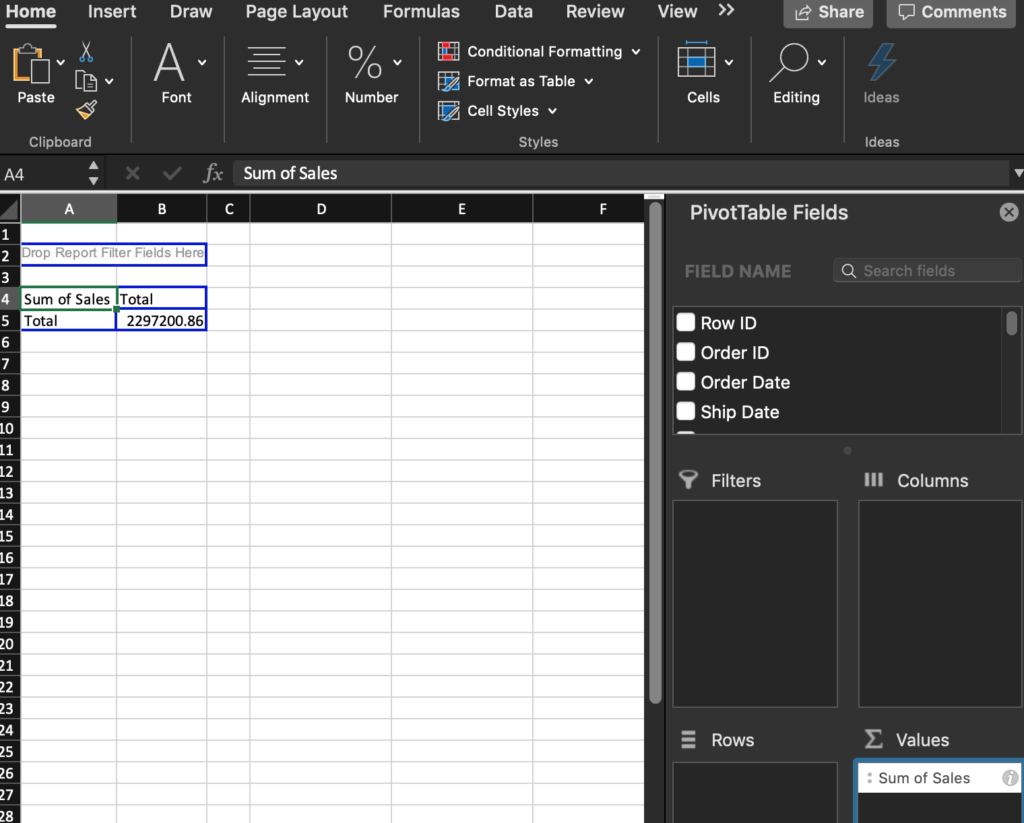
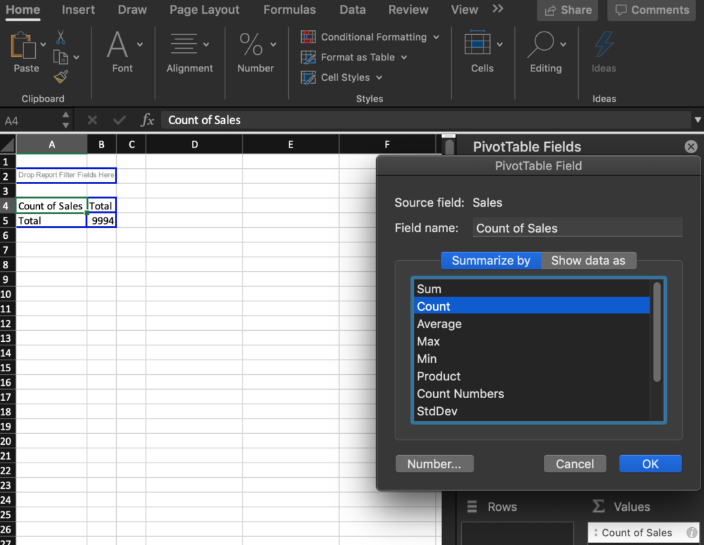
By default, Excel will sum the data as it sees that we have chosen a numerical field. We can change this by left-clicking on the “i” button on the far right corner of the “Sum of Sales” value. This will give you several formula options to choose from. We’ll choose “Count” which results in a count of all sales record instances.
Pro Tip! – Save time by formatting your data columns with the correct field type from the start such as Date, Number, or Text. Excel will automatically sort by Date data, Sum numerical data, and Count text or mixed data.
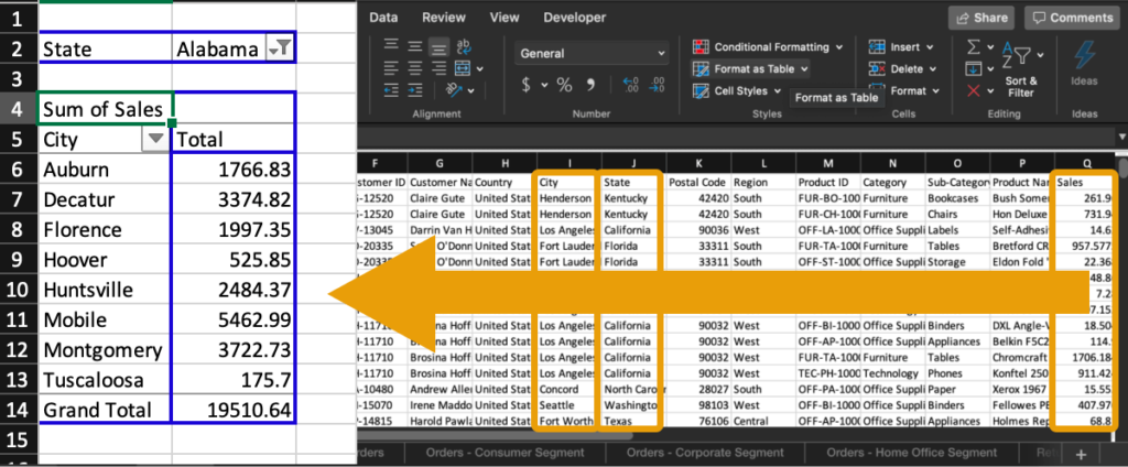
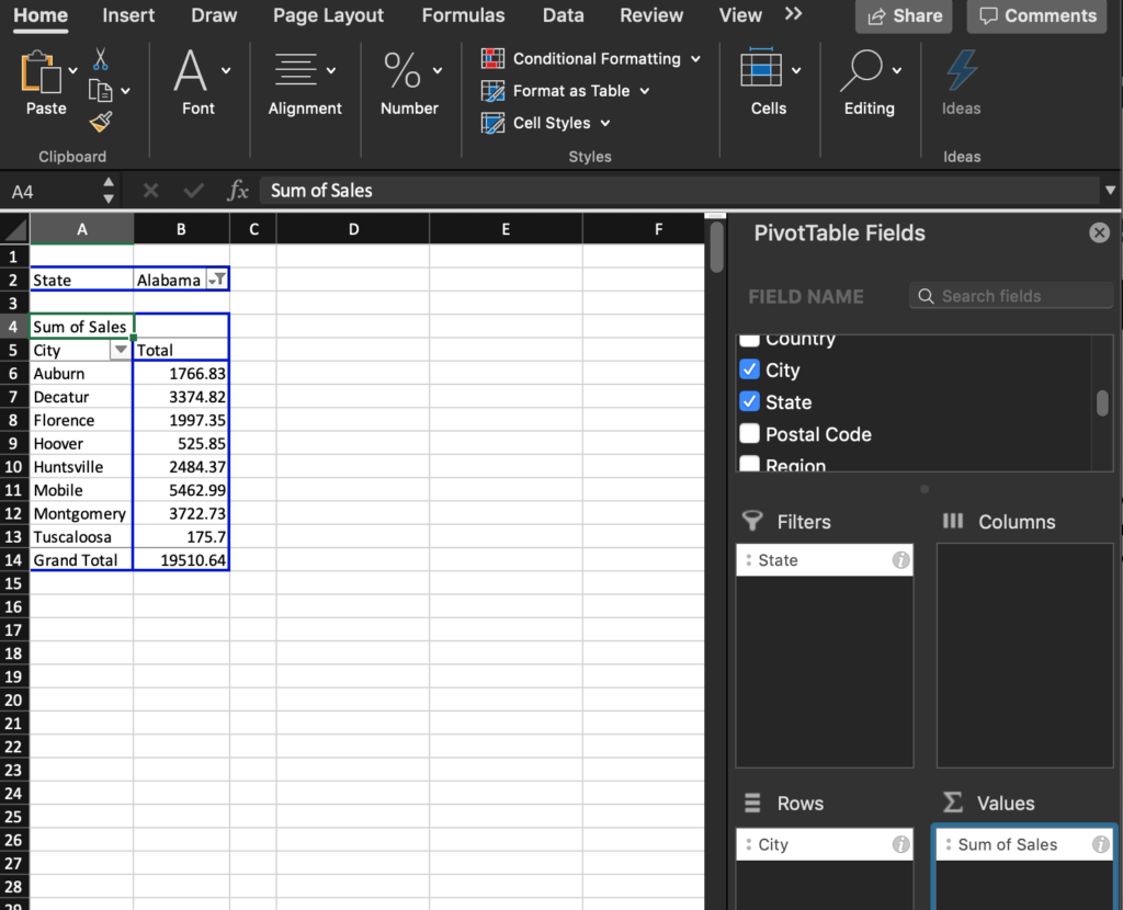
Now, let’s let Excel do the heavy lifting! Simply drag the “City” column from the list of fields to the “Rows” box within the PivotTable settings to break down the number of sales by city. You can also increase the depth of the PivotTable by dragging in an additional field, such as the “State” field, to the Filter selector in order to drill down into the data you are most interested in.

Create a PivotTable to Sum Values
There are other instances in which using the Sum of the data rather than the Count is more useful. In order to sum the data, go back to the “i” on the right-hand side of the “Count of Sales” field and choose “Sum”. Now we can see the total sales revenue broken down by each city.
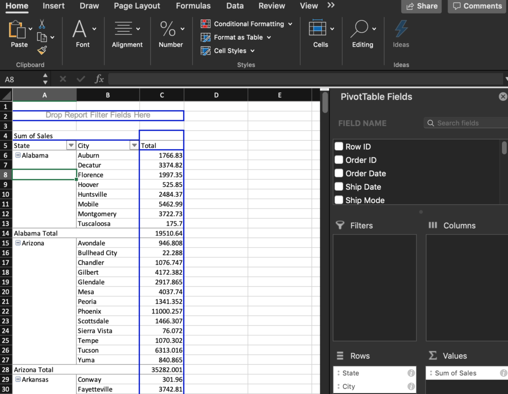
Depending on your goal, it is often helpful to stack different fields within the Rows or Columns selectors. For instance, placing the “State” field above “City” in the below example allows us to quickly see not only the highest-grossing states but also the individual city contributions within each state.
One of the most beneficial aspects of a PivotTable is that they are dynamic. You can move the fields around between Rows, Columns, Filters, and Values boxes on the fly to gain perspective and play with different analyses. Spend a moment moving the fields you are interested in between the boxes to get a better feel for how the PivotTable works. You may be surprised how quickly you can discover new insights!
Interactive Maps Made Easy
Sign Up NowCreate a Map of Sales Data
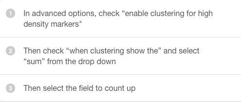
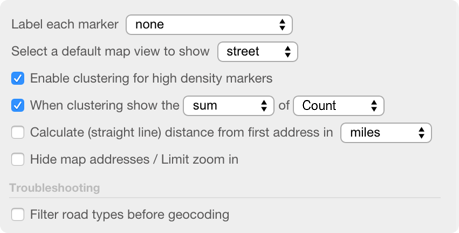
Now, if you have geographic data such as addresses, cities, or states as in the sales examples above, you can take your data analysis to the next level by visualizing the data on a map with sum clustering. Just like when we summed up our data in a PivotTable, BatchGeo’s mapping service has an advanced clustering feature. When enabled, this feature allows you to sum up the values of a specific field as a label for each cluster.
Pro Tip! – To enable sum clustering:
View Example Sales Data in a full screen map
Here you can see sum clustering data analysis on sales data broken out by city or state. Regions are clustered together and the cities and states are averaged. As you zoom in or even click on a cluster, you’ll see smaller clusters that demonstrate how the smaller areas contribute to the overall sum.