Author: Adam DuVander

Most Popular Official Languages in the World

The ability to communicate with each other is what separates human beings from animals. There are between 5,000 and 7,000 languages spoken throughout the world. The fact that there are so many different languages and yet we are still able to communicate is an amazing thing, and here at BatchGeo, we thought it would be pretty amazing to compile all of the most popular official languages throughout the world into one map.

View Official Languages by Country in a full screen map

As you can see on the map above, the most popular languages are available for filtering using the BatchGeo grouping feature.

There are five languages that are official in 10 or more countries: English (64), French (32), Arabic (27), Spanish (23), and Portuguese (10).

In addition to being the most popular, English is the only language officially designated on all six populated continents. Most of the 64 countries in which English is an official language are former territories of the British Empire.

Due to France’s position throughout history, as well as a history of colonialism, French is spoken throughout the world. Its designation as an official language, however, is situated mostly in Europe and Africa. The exceptions: Canada, Haiti, and Vanuatu.

Arabic, while nearly as common as French, is even more focused in its region of popularity. The Middle East and Northern Africa are home to all 27 Arabic-speaking countries. Similarly, many of those countries have some of the highest percentages of Muslim practitioners.

Spanish doesn’t have the European adoption of French, with Spain as the only country on that continent to consider it an official language. Still, Spanish manages to land in the fourth spot due to its incredible popularity in Latin America. Its only other locations are two countries in Africa (Western Sahara, Equatorial Guinea) and as the only language spoken officially on the South Pacific territory of Easter Island.

Finally, Portuguese may be fifth in terms of popularity, but its 10 countries are spread far and wide. The best known are likely Portugal and Brazil. Four others are on mainland Africa and two are African island nations. The other two? Macau (along with Mandarin and Cantonese) and East Timor, near Indonesia.

Our Monolingual World

Half the countries speak only one language, at least as an official language. On the monolingual list, English leads the way again, but not by nearly as much. There are 24 countries with only English as an official language, only 38% of all languages that have adopted English. By comparison, Spanish is the only official language of 19 of the 23 countries (83%) that “hablan español.”

Danish and Armenian have an interesting distinction not shared with any other languages. Danish is the official language in Greenland, Faroe Islands, and Denmark. Armenian is official in Nagorno-Karabakh and Armenia. And in all five of these countries, there is only a single language. In other words, 100% of countries that speak Danish or Armenian are monolingual.

There are another 26 monolingual countries that speak a language that is only official in that country. Most of them will sound familiar because they’re named after the one country that speaks it. For example Hungarian, Bulgarian, Latvian, and Lithuanian are probably not surprises. Some interesting ones from this group include Manx Gaelic (only official language of the Isle of Mann) and Gàidhlig (Scotland)

Countries with the Most Official Languages

Despite the large numbers of monolingual countries, a few go the other way. Seven countries have 10 or more official languages. All of these countries are in Africa, which has a history of both tribal dialects and multiple colonial occupants. Together these factors lead to many official languages.

The Republic of Benin, perhaps best known as the birthplace of Voodoo, has a population of only around 11 million. Yet, there are 21 official languages: Aja-Gbe, Anii, Bariba, Biali, Boko, Dendi, Fon-Gbe, Foodo, French, Fula, Gen-Gbe, Lukpa, Mbelime, Nateni, Tammari, Waama, Waci-Gbe, Xwela-Gbe, Yobe, Yom, and Yoruba. While three of Benin’s official languages can be found in other countries (French, Fula, and Yoruba) the rest of Benin’s 17 official languages are found exclusively in the country.

The second country with 10 or more official languages is Senegal. This far west country in Africa has 15 official languages for a population of around 15.5 million people. While French, Fula, Soninke, and Wolof are all languages found elsewhere, 11 of the 15 official languages are unique to Senegal.

Zimbabwe is the third country with 10 or more official languages. There are 14 official languages are spoken in Zimbabwe, which has a population of about 16 million people. Seven of those 14 official languages are exclusive to Zimbabwe, with English, Ndebele, Tswana, Chichewa, Venda, and Xhosa being spoken in other countries but the rest can only be found in Zimbabwe. The southernmost country of Africa, South Africa, right below Zimbabwe, has 12 official languages. Of those 12, four are unique to the country.

Mali, like South Africa, also has 12 official languages, one of which is Arabic which is only spoken in the Northern half of countries within Africa aside from the islands of Comoros in the Southern part. Niger, bordering Mali to the east, has 11 official languages, five of which are exclusively found in Niger. Finally, Ghana has exactly 10 official languages. Aside from English, all of the languages in Ghana are unique to this country.

Whether you live in a country that has one official language or 21 official languages, the map above provides some insights into the countries around the world and the languages spoken there. No matter if you are most familiar with a language that is official in 10 or more countries, or you are more familiar with a language utterly unique to your own country, we’ll always have some form of language to communicate with.

Where U.S. Beer is Brewed

Across the United States, we’ve started to describe liquid in colors like straw, deep gold, copper, and red-brown. We even distinguish between light black and dark black—isn’t black just black? Not when you’re describing beer from the thousands of breweries that have sprung up in the last ten years. Microbrews are too big—now there are nano brews, which has quadrupled the breweries nationwide since 2007.

View Breweries by State in a full screen map

On the map above, you see each state, with a marker colored to match its current number of breweries. Click the “2017” in the lower left of the map to change years, or see the 10 and 20-year growth rates. Dig into the details in the map, or see below for the stories we found in the data.

Top 10 US States by Brewery Count

  1. California (981)
  2. Washington State (448)
  3. New York (420)
  4. Colorado (408)
  5. Michigan (402)
  6. Pennsylvania (352)
  7. Oregon (323)
  8. Florida (287)
  9. North Carolina (287)*
  10. Texas (279)
    * Technically, North Carolina is tied for eighth with Florida.

The most populous state in the country, California also leads the way in breweries. Its 981 is more than numbers two and three combined. That includes New York, the third-most populous state. California’s reign goes back as far as our data does. In 1984, California’s nine breweries accounted for over 20% of all US breweries tracked.

Many states have moved up and down in the rankings in the last 20 years. Colorado was second to California in 1997 and 2007 but slipped down to fourth in 2017. Oregon has also bumped down two notches in the last 10 years. It’s not that they haven’t grown—both states have more than tripled breweries during this time—but that they haven’t grown as fast as others.

New York, for example, climbed into the top three from the eighth spot in 2007. North Carolina jumped into the top 10 with an over 600% growth rate. To make room, others had to leave the top 10. Most notably is the state whose baseball team is called the Brewers. Wisconsin dropped 10 places in 10 years, from the fourth-most breweries in 2007 to #14 in 2017.

Of course, Wisconsinites might argue the state produces a lot of beer, even if its number of breweries haven’t kept up. That’s an important distinction to make. This map, and the data within it, covers individual breweries, not barrels of production. Since 11 brewers make over 90% of US beer, that map might not be quite as interesting.

Overall Growth in Breweries

California brewery growth
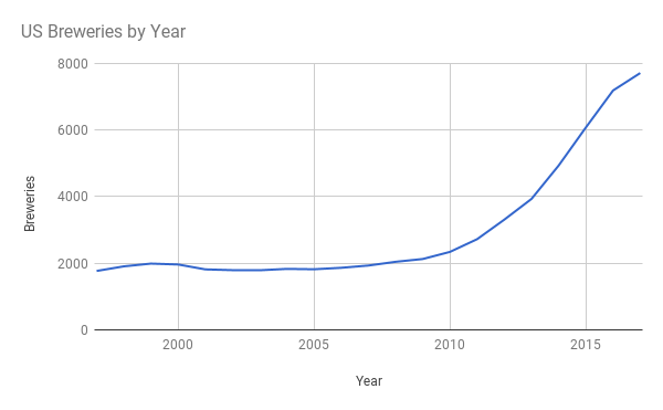
The growth in the number of breweries tells the story of proliferating microbrews. This is a nationwide trend that we see present in just about every state. You’ll see a chart for every state by clicking the marker above it on the map. For example, the one embedded here is California’s. The shape of many of these charts is similar, showing the pattern nationwide. While there was modest growth between 1997 and 2007, the greatest growth has come during the last ten years. In fact, the story becomes even clearer when we look at the national numbers by year instead of by decade.

Slight growth at the end of the 20th century turned to decline during the recession of the early 2000s. The number of breweries remained relatively flat until 2009 or 2010, the beginning of the increase that further spiked beginning in 2013.

The apparent recent drop in growth rate is actually due to incomplete data for 2017. The current count of breweries is as of the end of the first quarter, so it is reasonable to expect continued growth. In fact, we’re on pace to add 2,000 new breweries in one year, the first time that’s ever happened. If that pace continues, 2017 will add nearly double the number added in 2016.

Fastest Growing Brewery States

  1. Arkansas (900%)
  2. Alabama (740%)
  3. Virginia (680%)
  4. North Carolina (637%)
  5. Texas (620%)
  6. Florida (574%)
  7. Indiana (570%)
  8. North Dakota (566%)
  9. New York (545%)
  10. Minnesota (538%)

The growth rates listed above reference the last ten years, the time when most of the brewery growth has happened. As is the case with high percentage growth, many of these states had very few breweries in 2007. Arkansas, for example, had only four breweries in 2007 (the same number it had in 1997). Now Little Rock and Fayetteville lead the way and the entire state boasts 36 breweries. Similarly, Alabama jumped from five in 2007 (down from eight in 1997) to 37 in 2017.

Many on the list started above Arkansas and Alabama’s current levels in 2007, and still grew at rates close to those southern states. New York had 77 breweries in 2007 and now has over 400. Texas and Florida both decreased considerably between 1997 and 2007 but bounced back in a big way thanks to the national trend, now with 279 breweries in the Lone Star State and 287 Sunshine State breweries.

Perhaps most indicative of the nationwide growth is that the slowest growing states still doubled the number of breweries in ten years. Hawaii, with just a dozen breweries in 2007, now has 25. Brew-happy Wisconsin, which lost its spot in the top 10 overall, still added 132 breweries, a growth rate of 226%.

No matter the color of beer you drink, it’s clear that there are more options than ever. And that trend appears to be continuing, with more breweries than ever set to be added this year. So raise a pint of pilsner, porter, or IPA to thousands of US breweries, coast to coast.

How to Create a Customer Sales Map from Excel or Any CRM

Gain advanced insights on your business when you visualize your data analysis. You’re probably swimming in data, in Excel, Salesforce, or another CRM. Understand the story within your data by plotting it on a map. Any geographic information, from full addresses to names of regions can be converted to geo coordinates. Viewed spatially, you’ll get a whole other angle at your customers, leads, or assets data.

View Household income, average clustering in a full screen map

For example, the map above shows the median income for every county in the United States. Better yet, using clustering technology, we can get a summary of the underlying data at any zoom level. Now imagine that this contained your revenue by region or the spending power of your customers. Quickly, you’re able to see the most successful areas, in ways that are difficult or impossible when your data is sitting inside a spreadsheet or CRM.

Ready to map your customers? Let’s get started with the simple two step process.

1. Find Your Customer Locations

Before you can plot your customers on a map, you need to know where they live or work. This can come from many sources, and you likely have it already. If you don’t, you may be able to gather it from the data that you do have. The level of detail for location can vary, yet even non-granular data can provide good insights.

Some of the location data you may have about your customers includes:

  • Full address
  • Zip code
  • City name
  • County name
  • State name
  • Country name

Any of the above can be converted to geo coordinates. If you have none of the above, all is not lost. Here are two additional ideas for finding your customer’s locations:

  1. IP address: If they have visited your website, you have their IP address, or Internet Protocol address. This series of numbers identifies their computer, network, or internet service provider. Usually, these can be converted to at least a regional location. BatchGeo automatically detects and geolocates IP addresses in your data.
  2. Email address: Many companies collect the email address of customers when they create accounts or to send receipts for purchases. There are data enrichment companies, such as FullContact or Clearbit, that will take a list of email addresses and return name, location, and other data about the person behind the email address.

Once you have some location data, you can easily create a map from it.

2. Map Your Excel Data

Many companies keep customer data in Excel and other spreadsheets. Even if that’s not the “source of truth,” Excel is where many filter and analyze their data. That’s why BatchGeo has chosen spreadsheets as the primary way to get data into our mapping platform.

From within your spreadsheet program, highlight all your data, including the headers. Use Ctrl+C (Cmd+C on Mac) to copy the data. Then go to the Excel mapping tool on the BatchGeo homepage and put the data in the main box using Ctrl+V (Cmd+V on Mac) to paste.

The video above walks through a basic map, or you can find a full Excel mapping tutorial that walks through step by step.

View Example Sales Map in a full screen map

The result is a map with a marker for every row in your spreadsheet. In the case of the map above, we used aggregated state-level data, but you could show individual customers or leads. Any data that has a location is fair game for a map.

Export Data From Your CRM

Many times the source of truth for customer data is in one or more systems, such as customer relationship management (CRM) software. You’ll frequently want to use this data outside of your CRM, such as when you want to create mail/email campaigns, analyze in Excel, or create a map from the data.

Any good CRM should have the ability to export your data. If it doesn’t, you should probably get a new CRM, even though it will take a lot of effort to duplicate your existing data (since you can’t export). You might ask about an API (Application Programmer Interface), which is a more technical option to get your data. Unless you’re a programmer, you’ll need someone else to use it, but an API often means there are existing tools that others have wrote to help you retrieve your data.

The most common file formats when exporting from your CRM are:

  • CSV (Comma-separated values)
  • Tab-delimited
  • Excel

Any of the above will work to create a map using BatchGeo. Excel can read or import any of those file types, then you can copy from the spreadsheet as described above in step 2.

How you export will vary depending on the software you use. For example, in Salesforce you would use the Data Loader export wizard to create a CSV to download. You should be able to search the help section of your CRM or ask for technical support to help export your data.

Make Your Customer Map Today

Start uncovering the story behind your customer data. Create a map now with a simple copy-paste of your spreadsheet or CRM data.