Author: Adam DuVander

Open Data and Open Source Geocoders

Converting addresses and place names to geographic coordinates—known as geocoding—is extremely useful. In order to plot points on a map, you first need to translate human-readable versions of a place to ones that computers can understand. There are many ways to make this happen, and entire industries built around supporting them. In this post, we want to take a look at the options based on open data. That is, data that is publicly available, either from governments or communities. In many cases, the geocoding software used to access this data is also publicly available as open source.

We’ll include five popular ways to geocode using open data (and sometimes open source). But first, consider what open geo data is and what alternatives exist.

Pros and Cons of Open Geo Data

Collecting and maintaining data about every street and place in the world is a huge undertaking. There are entire companies—big companies—built to do just that. Among them are TeleAtlas (part of TomTom) and NavTeq (acquired by Nokia). And, of course, there is also Google, which in many areas of the world uses its own dataset, often collected with its StreetView vehicles.

Licensing data is expensive, and these companies make hundreds of millions in revenue. That is one of the biggest arguments in favor of open geographic data. Like open source, it is community-supported, and available for anyone to use. Open data sidesteps licensing requirements, so therefore should arguably be less expensive.

On the flip side, the big players are a monetary incentive to maintain their data. They have the revenue to cover the globe in quality assurance. In other words, the paid data should be better.

Yet, in some areas, especially remote and quickly-changing places, volunteers are able to better update the data. Volunteers are more likely to ensure their own areas are mapped when it’s not economically viable for a larger company to take it on.

In the end, the quality of the data depends on the type of data and location coverage needs. When considering mapping services, test several, and go with the one that fits your project. For this post, we’ll show several options for open source and open data geocoders.

Mapbox: Fully Configurable Mapping as a Service

Perhaps best known for its customizable map studio and visual representation of geo data, Mapbox is a complete mapping solution. That includes a robust geocoding offering based on open data, both public and community-created.

One major distinction between Mapbox and some of the other tools listed here: it is neither open source, nor free (although there are no fees for less than 50,000 requests per month). That said, it fits the distinction of being based on open data. When paired with Mapbox maps, you can fully configure how the map styles look. Compared to running your own geocoder, you don’t have to keep data updated or run a server to translate addresses to geo coordinates.

OpenCage: Geocoder-Focused Service

Like Mapbox, OpenCage is based on OpenStreetMap and other open data sources. Unlike Mapbox, which has many different mapping tools, OpenCage is completely focused on geocoding. While OpenCage also charges for its service, the free plan is generous—2,500 requests per day, which works out to 75,000 free requests per month.

The company is even more generous to paying customers:

If you are on the free trial, when you hit 2,500 requests in a day you begin to receive a 402 HTTP response code. If however you are a paying customer, when you reach your limit we do … nothing. The limits are “soft” in that if you need more requests on a given day, nothing happens, you can keep geocoding. If you cross the limit repeatedly then the following month we ask you to move to the next higher tier.

OpenCage sits atop numerous open data and open source projects, as seen on its credits page. The tools are combined to create great results world-wide.

Pelias: Run Your Own Geo Server

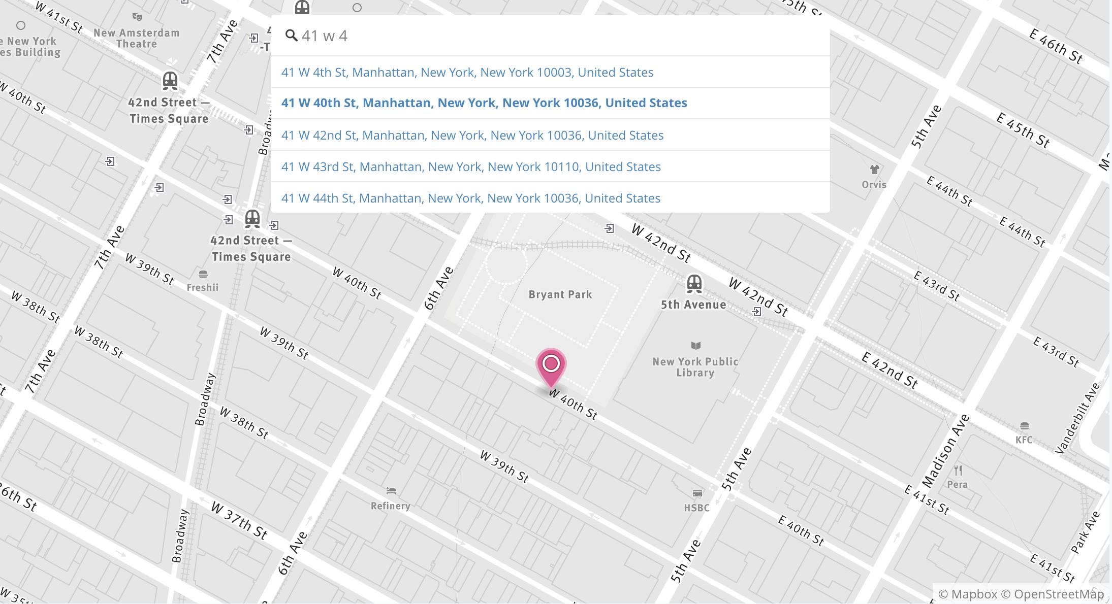
Pelias describes itself as “a distributed full-text geographic search engine.” Previously, it was part of a for-profit company called Mapzen, which ran a hosted version of Pelias as a service. Though the company is no longer in operation, Pelias is entirely open source and based on OpenStreetMap and other open data. Therefore, if you have some technical skills, you can run it yourself.

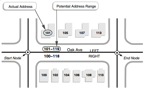
Running your own Pelias server requires Node.JS, ElasticSearch, and various supporting libraries. You can import its data, which has 285 million address points available, and can provide results for many more given interpolation (as shown in the image above).

Pelias is a powerful option that requires some technical chops to run on your own.

Nominatim: OpenStreetMap’s Geocoder Service

Nominatim is a search engine for OpenStreetMap data. You can connect to it as a service for free, but has some very strict usage requirements. Nevertheless, the service can help you test OpenStreetMap data to see if it will work for your needs.

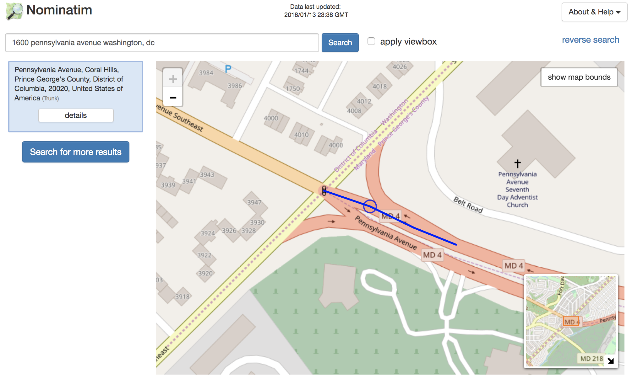
For production use, it’s best to install Nominatim yourself. It requires PostgreSQL with PostGIS and several other languages and libraries. Like Pelias, you’ll want to have some technical background to run it on your own.

OSM Names: OpenStreetMap-based Geocoder Service

Lastly, if you’re looking for place search, rather than full addresses, you may be happy with OSM Names. The OSM, as you may have guessed, stands for OpenStreetMap, the community project many of these open data geocoders are based upon. In this case, landmarks, cities, and postal codes are included in OSM Names. For many uses this can suffice!

The service is available as an API, as well as to download and install yourself.

Overview of Geocoding Options

Using open data and open source geocoders can be as simple as an API call away (obviously not simple for everyone) or as complex as installing software on your own servers. The quickest start—and sometimes best data—is available from services for a monthly fee. But if you’re looking to have the most control, you can go with the open source options that only cost you your time.

Name Open Data Open Source Addresses Places Free
Mapbox Yes No Yes Yes Limited
OpenCage Yes No Yes Yes Limited
Pelias Yes Yes Yes Yes Yes
Nominatim Yes Yes Yes No Yes
OSM Names Yes Yes No Yes Yes


As you can see, if all of these things are important to you, you’ll want to go with Pelias. But, as mentioned previously, it’s worth comparing several options to each other. You can even compare the open versions to the geocoders from Google, Microsoft, and others.

Batch Geocode Without a Line of Code

Making maps is hard and, as we’ve seen above, so is running your own geocoder. You can convert your list of locations into a beautiful map in minutes using this geocoding tool. No code required.

Route 66 Map: Historic Locations You Can Still Find

Blazed across the middle of the United States is a path well-known to mid-1900s road trippers. Route 66, or “US 66,” as it was officially known, was a major thoroughfare for getting around the country prior to the modern highway system. It follows from the midwestern hub of Chicago, across the country to southern California. Its history traces back to the 1920s, and it was a popular route during the Dust Bowl of the 1930s. In the 1940s a song popularized it, encouraging you to “Get Your Kicks on Route 66.”

View Route 66 Map in a full screen map

You can still travel some of Route 66 and many of its historic attractions are still visitable along the way. Rather than hop in your car, you instead can get your kicks right from the map above, and some highlights pulled out below.

15 Route 66 Motels You Can Check Out (But Maybe Not Check In)

Of the motels on our map of Route 66 landmarks, most of them are no longer in operation. Some are used as private residences, museums, and restaurants. Others are simply closed. But here are five where you can stay the night.

Blue Swallow Motel

Located in Tucumcari, New Mexico, the Blue Swallow Motel still shines its neon on Route 66. For about $80 per night, you can stay in one of its 14 rooms.

Tewa Motor Lodge

Another New Mexico roadside attraction where you can spend the night, one of the 25 rooms at the Tewa Motor Lodge in Albuquerque will run you just $45.

El Rancho Hotel

“Charm of yesterday… convenience of tomorrow” reads the neon of El Rancho in Gallup, New Mexico. With 53 rooms, it is the largest of the remaining hotels on Route 66. And for $110 a night, you can still stay in one of them.

Wigwam Village Motel #6

In Holbrook, Arizona, you’ll find 15 concrete and steel wigwams. Part of Wigwam Village Motel #6, you can stay here for $56 per night

Aztec Hotel

Finally, you’ll find the Aztec Hotel in Monrovia, California, just outside Los Angeles. Located near the end of Route 66, the Aztec has been closed in recent years and now apparently charges by the hour for its 44 rooms.

What Became of Former Motels on Route 66?

There are a couple other motels you can still visit, even if you can’t spend a night.

  • Durlin Hotel in Oatman, Arizona, is now a bar, restaurant, and museum called Oatman Hotel.
  • Painted Desert Inn, located in Arizona’s Petrified Forest, is currently a museum and bookstore.

Still others you can see from the outside:

  • Luna Lodge (Albuquerque, New Mexico) is low income apartments
  • West Winds Motel (Erick, Oklahoma) is a private residence
  • Ranchotel (Amarillo, Texas) was converted to apartments
  • Chelsea Motel (Chelsea, Oklahoma) is now used for storage

Others may be visible, but are not visitable: De Anza Motor Lodge (Albuquerque), El Vado Auto Court Motel (Albuquerque), Red Cedar Inn (Pacific, Missouri), and Vega Motel (Vega, Texas) are all closed.

11 Historic Business Districts on Route 66

While the old Route 66 takes you through many cities, the National Park Service has specifically identified almost a dozen downtown areas. Many are in the historic registry of places.

  • McLean, Texas (population 778)
  • Amarillo, Texas (population 199,582)
  • Glenrio (New Mexico and Texas border)
  • Santa Rosa, New Mexico (population 2,680)
  • Albuquerque, New Mexico (population 559,277)
  • Fort Wingate, New Mexico (area near Gallup)
  • Winslow, Arizona (population 9,754)
  • Flagstaff, Arizona (population 71,459)
  • Seligman, Arizona (population 10,031)
  • Kingman, Arizona (population 29,029)
  • Needles, California (population 4,988)

Find them using the search on the map, or filter by “City” landmark type.

Fill Up Your Tank, Stomach, or Imagination

Gas stations: All along Route 66 you’ll find service stations, both modern and historic. There are 15 highlighted on the map above, including Tulsa’s Vickery Phillips 66 Station, and Sprague’s Super Service in Normal, Illinois.

Restaurants: There are seven historic restaurants on the map, including Rock Cafe in Stroud, Oklahoma.

Theaters: No road trip would be complete, especially in a time without television, without a trip to the theater. From East Springfield, Missouri, to Los Angeles, there are seven historic theaters to see on Route 66.

Find Your Closest Route 66 Site

If you’re in the continental US, you may be closer than you think to Route 66 Americana. The search box in the map can guide your way.

For example, if you live in Kansas City, Missouri, just type that into the search box and press enter. You can also use postal codes or full addresses. For Kansas City, you’ll discover that the closest location is
66 Drive-In, which is located in Carthage, Missouri.

If you only want to find specific landmark types, filter the map first and then search again—your results will include only those currently displayed on the map.

From Spreadsheet to Interactive Map

Whether you have a list of locations along an old highway, or a spreadsheet of customers to visit, BatchGeo can help turn your location data into a visual map that’s easy to use.

Create your map today—it’s as simple as copy and paste.

How to Add Inline Charts to Your Maps

Maps tell a story, taking flat data and adding the dimension of location. Similarly, charts and graphs often show data over time. Wouldn’t it be great to blend these together? In this post, we’ll show you how.

View Sales Map for Inline Charts in a full screen map

Take the examples above, two ways of showing customer data. First, the map shows the locations of your top ten customers by sales volume. On the right, you see the same ten, displayed by sales per month over the last year. Each is showing some data that the other isn’t.

Now, consider this merged map:

View Sales Map for Inline Charts with Charts in a full screen map

You can peruse the underlying map data by selecting a field in the lower left. You can see the total sales, for example, to determine which locations are higher than others. Click on each location, and you’ll see the actual sales chart for this location over the last 12 months.

In a single map, you can quickly get the full story, more than is communicated even with the map and chart combined. Let’s walk through how this map was built, and how you can make one with your own data.

Decide Which Data to Display on Your Map

To create a map, the only data you actually need is a set of locations. Technically, a location is described with latitude and longitude coordinates. In practice, an address, postal code, or region name is sufficient. BatchGeo will perform the geocoding to convert location descriptions into coordinates. In addition, any other data you have can be grouped and filtered. Some of this additional data will be what you’ll include in the chart in the next step.

Let’s stick with the sales example above. The sales data and locations of the 10 customers is probably stored in a spreadsheet. You might have a column for the customer name, address, city, total sales, and sales for each of the last 12 months.

You could put all of this on your map, but only if you expect you’ll want to look at the top customer in June, then turn around and find the top customer in October. More likely, you’re looking for summary data and sales growth. One useful approach could be to calculate the growth rate from the first month through the last month as its own column. Whatever fields you choose to include in your map, keep in mind each one will extend the information box when viewing an individual location. Also, the chart in the next section should provide a much easier view of the monthly data.

Note on growth rates: If seasonality could be a factor, you could make sure you have at least 13 months worth of data, so you’re comparing to the same month the year previous.

Let’s say you’ve decided to only show the annual total for each customer. Don’t start deleting data from your spreadsheet. Instead, create a new sheet in the same workbook, or even create new columns to the right of your source data. These new columns will be the ones you use to create your map, so they need to be all together for easy copying. You can use cell references so that if you ever update one set of data, it updates the other.

Generate Chart Image URLs

When we decided what data to include along with the map, we eliminated the individual month data. We want to revive that useful data where it is displayed best: in a simple line chart. By creating chart images for each customer, we can embed it into the information box of each map location.

Many charts have a lot of extra labels, a legend, title, and more. Those are important when displaying a chart on its own, because it gives the viewer some context. In this case, we’ll be displaying it alongside other data, so we want to streamline what is displayed. You can play around with creating these charts using this tool. By doing that, I came up with this streamlined chart:

Here we can see simply the change in sales for one customer over 12 months. Now we want to generate those URLs for each of our customers. We can do this dynamically, by inserting our data into the "chd=t:” section of the URL. There’s one thing that makes those chart numbers a little tougher: we need to scale them so each number is between 0 and 100. Since we’re generating this URL in a spreadsheet, that should be fairly each with one gigantic sequence of formulas.

The formula will calculate where each month lies on the scale based on the lowest month being 0 and the highest month being 100. For example, in my spreadsheet the 12 months are columns E (January) to P (December). To find March’s scaled value for the customer in row 2, we use this formula:
=ROUND(100*((G2-MIN(E2:P2))/(MAX(E2:P2)-MIN(E2:P2))), 0)

The result is 17, because March’s $1,401 is closer to the lowest month ($1,190) than the highest ($2,423).

Now we repeat that for each month. Everything above stays the same except the “G2” becomes the column for the appropriate month. We’ll then use CONCATENATE to insert the values into the chart URL. Here’s the complete formula:


=CONCATENATE("http://chart.apis.google.com/chart?cht=lc&chs=120x80&chd=t:", ROUND(100*((E2-MIN(E2:P2))/(MAX(E2:P2)-MIN(E2:P2))), 0), ",", ROUND(100*((F2-MIN(E2:P2))/(MAX(E2:P2)-MIN(E2:P2))), 0), ",", ROUND(100*((G2-MIN(E2:P2))/(MAX(E2:P2)-MIN(E2:P2))), 0), ",", ROUND(100*((H2-MIN(E2:P2))/(MAX(E2:P2)-MIN(E2:P2))), 0), ",", ROUND(100*((I2-MIN(E2:P2))/(MAX(E2:P2)-MIN(E2:P2))), 0), ",", ROUND(100*((J2-MIN(E2:P2))/(MAX(E2:P2)-MIN(E2:P2))), 0), ",", ROUND(100*((K2-MIN(E2:P2))/(MAX(E2:P2)-MIN(E2:P2))), 0), ",", ROUND(100*((L2-MIN(E2:P2))/(MAX(E2:P2)-MIN(E2:P2))), 0), ",", ROUND(100*((M2-MIN(E2:P2))/(MAX(E2:P2)-MIN(E2:P2))), 0), ",", ROUND(100*((N2-MIN(E2:P2))/(MAX(E2:P2)-MIN(E2:P2))), 0), ",", ROUND(100*((O2-MIN(E2:P2))/(MAX(E2:P2)-MIN(E2:P2))), 0), ",", ROUND(100*((P2-MIN(E2:P2))/(MAX(E2:P2)-MIN(E2:P2))), 0), "&chco=FF0000")

That looks mighty complicated, but keep in mind what we’re doing here is to fill in the 12 scaled values to make that chart URL. Excel formulas aren’t known for their brevity, but they get the job done.

Put Them All Together

You can use spreadsheet magic to copy the giant formula we created for one customer to all the other customers. The row references in your spreadsheet (E2, F2, etc) should update as you paste (E3, F3, etc). When you have chart images for all the customers, we’re finally ready to make our map.

Using our map making tool, copy and paste all the data you want as part of your map. Be sure to include the header row, the location column, as well as the chart column.

  1. Paste all the data into the map tool box
  2. Click Validate & Set Options
  3. Double check that BatchGeo is using the right columns for the address, city, etc.
  4. Click Show Advanced Options
  5. For Image URL, choose your chart URL column
  6. Click Make Map!

Now check out your map, complete with inline chart!

View Sales Map for Inline Charts with Charts in a full screen map

Click any of the customer markers and you’ll see the data we selected, as well as the chart embedded right there.

You now have a customer map (or whatever data you’ve used) with the data available for filtering, as well as the time series data in an inline chart. Packed into your single map are the many stories in your data.

Create your map now!