Use Grouping to Make the Most of Your Map
Online maps can be indispensable to navigate, explore, and visualize information. However, the power of these maps is often underutilized.
In this post, we’ll showcase how you can maximize your online maps by grouping data using markers. But before you can make the most of your online maps, let’s cover some basics.
Map-Making on the Web
You don’t need a background in geography or any programming knowledge to create custom maps on the web, but there are some important pointers to keep in mind as you create them.
Typically, web-based mapping tools rerquire a spreadsheet of the data you want to map — this can be in Excel, Google Sheets, or other compatible alternatives.
The data should include at least some location information, with separate columns for address, city, state, country, etc. If your data isn’t already separated, you can use the “Text to Columns” functionality to do so quickly.
In addition to location details, your data may include other information; one example is the height metric you can see on our map of the tallest lighthouses in the US.

This brings us to map grouping, through which you can select only the markers that meet certain requirements, filtering out the rest. Let’s talk about the benefits of map grouping.
What Is Map Grouping?
Groups can be combined to zero in on specific results, giving you insight into the story behind the map. While no prep work is required (BatchGeo will intuitively find a home for any additional data you have), you can certainly make the most of grouping by doing a bit of data manipulation, which we’ll show you next.
View Global city rating in a full screen map
The map above of every city’s globalization rating contains location information (in this case, city and country names). It also includes the classification, which becomes available for group selection.
Let’s try grouping some markers. Let’s say you want only the cities with the best globalization classification (Alpha + and Alpha ++):
- Hover above the dropdown in the lower left of the map to reveal the grouping columns.
- Choose ‘Classification’ from the menu. Each marker on the map will change color based on its group.
- Select the top two ranges (‘Alpha +’ and ‘Alpha ++’). As you select each, the map will filter to include only the markers that match your selection.
Troubleshoot Missing Map Groups or Ranges
Interactive Maps Made Easy
Sign Up NowOne common hiccup in grouping is missing groups or unexpected formatting within your mapped data. But there are ways to troubleshoot these issues, as we’ll cover next, starting with missing groups.
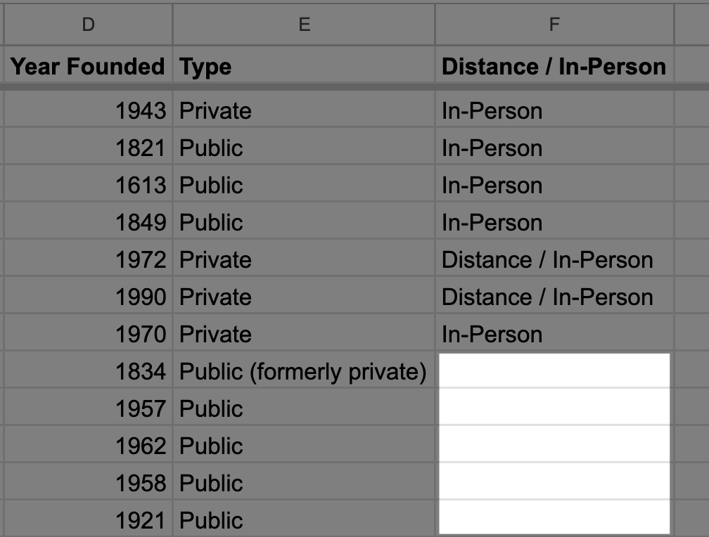
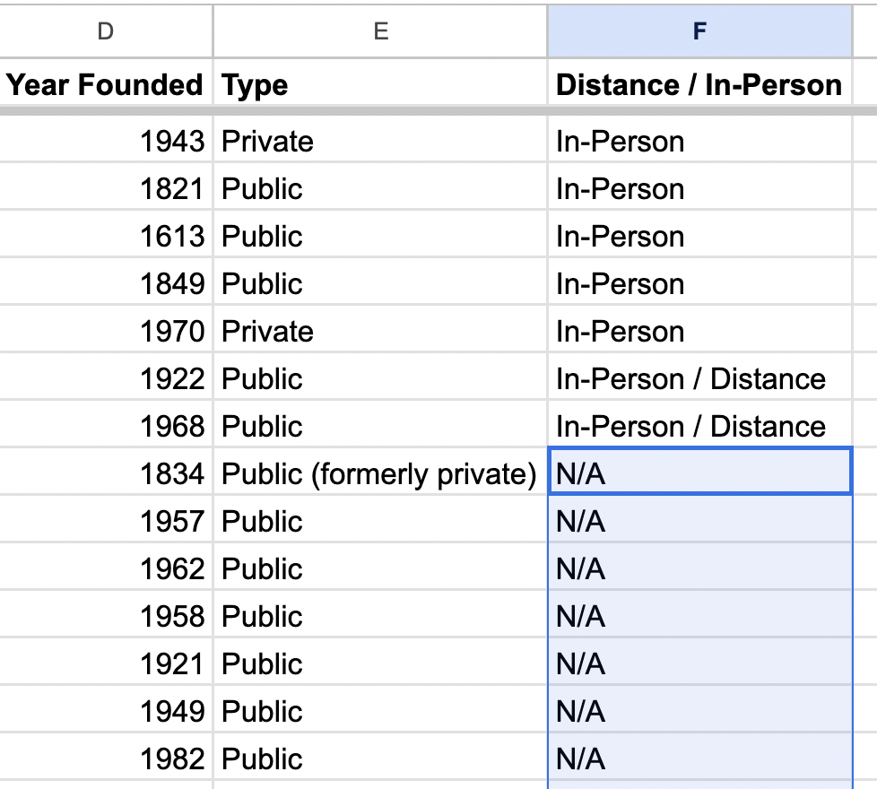
Fix Missing Groups with “N/A”

If you find that a column eligible for grouping is not showing up in the dropdown menu at the lower left-hand corner of your map, follow these steps for effective troubleshooting:
- First, return to your spreadsheet and identify the column or columns that aren’t showing up for grouping.
- Next, look for any empty cells in columns that normally contain data.
- Sort the column(s) to push the empty cells to the bottom.
- Input “N/A” into the first empty cell, ensuring it’s in all caps.
- Drag this entry down to apply “N/A” to all empty cells.

Once completed, edit your map with the new data, and the missing groups should appear.
Adjust the Format of Non-Ranging Numbers
If your numerical data is grouping correctly but is lacking your desired ranges, it’s time to make further adjustments in your spreadsheet. Follow these steps to rectify the issue:
- Identify the column with the numerical data that isn’t ranging.
- Head to the “Format” menu and check the current format under “Number.”
- Toggle to “Plain text” or “Automatic”, whichever is not currently selected.
Of course, if you’d rather not have your data grouped, you can disable it by editing your map. In “Validate and Set Options,” select “Single Color” for the Group By option.
Maps Work Better with Grouping!
Thanks to online maps and the grouping feature from BatchGeo, understanding your location data is easier than ever.
