The Best Way to Make A Google Map Using Google Spreadsheet Data
If you’re like us, you keep a lot of data in Google Spreadsheets. With many of the features of Excel and the ability to easily collaborate, it’s no wonder this has become the go-to for many business and personal use cases. At BatchGeo, we’ve noticed spreadsheets are a popular place to store location data, such as customer locations.
That’s why we built a way to quickly turn spreadsheets into maps. Below we’ll show you the best way to convert your Google Spreadsheets data into beautiful, interactive maps. In fact, this works for any spreadsheet application you use, with nothing to install or download.
1. Identify Your Location Data

Before you can make a map from your data, you’ll need to figure out if you have any geographic terms in your spreadsheet. There are many different types of location data, but it works best if it’s structured. You’ll see what we mean in the examples below.
Your location data will then be converted into geographic coordinates through a process called geocoding. The result is an estimate of the actual coordinates needed to plot the place on a map. Depending on the type of location data, the point can be highly accurate.
Addresses
Addresses are a really useful type of location data because they are common, human-readable, and specific. In fact, there’s probably an address to describe the place you live!
- Full address is a single field with an entire address, including city, state/province, and postal code.
- Segmented address is multiple fields for each piece of the address.
- Partial address may be missing a street number, a city, or other information. Most geocoders will make educated guesses for partial addresses.
If you have customer data, you may very likely have an address for them! Mapping customers can help you make important business decisions and analyze where you’ve been successful with your efforts. These maps can even help you plan specific customer visits, because an address gives you an exact location.
Regions
For many analyses, a general location is enough information to get an interesting map. If you’re looking at a global scale, having an exact address is not that different from knowing a location’s city, for example. The marker will appear to be in roughly the same place. Regional data is often easier to find than specific address-level data, giving you more opportunities to map your data.
Some examples of regions you can convert to geographic coordinates:
- Countries
- States or provinces
- Counties, parishes, or other localities
- Postal codes
Regions are larger than places described by an address, so the “point” provided is less specific. Typically, geocoders use centroids, such as the geographic mid-point within a city’s boundaries.
One advantage of regions is that you can often glean this from other data. For example, some services can tell you a city of the person behind an email address. You can also geolocate by IP address for visitors of a website, for example.
Coordinates
The last type of geographic data is the simplest and most specific. It is not particularly human-readable, however. Raw coordinates are referred to as latitude and longitude pairs, because there are two numbers that plot a point on a two dimensional plane representation of earth.
For example: 44.4604788, -110.8281375
You could use those two numbers to find Old Faithful, one of the Geysers of Yellowstone National Park.
Often coordinates are listed in “latitude, longitude” format. However, annoyingly, sometimes they’re written in the reverse! For this reason, it’s best to include these as separate, named, fields. In other words, if you have coordinate data, your spreadsheet should include a latitude column and a separate longitude column.
2. Copy and Paste From Your Spreadsheet
Now you’ve discovered the location data within your Excel, Numbers, Google Sheets, or other spreadsheet! You’re ready to convert your spreadsheet into a map—that’s why you’re here, right?
To create a basic map, all you need is your location data. That can be as simple as a list of addresses, like this:
- Hotel Address
- 3570 Las Vegas Boulevard South Las Vegas, NV
- 2000 Las Vegas Boulevard South Las Vegas, NV
- 3400 Las Vegas Boulevard South Las Vegas, NV
- 3799 Las Vegas Boulevard South Las Vegas, NV
- 3600 Las Vegas Boulevard South Las Vegas, NV
If that was a column in your spreadsheet, you could simply copy it and paste into the box at the top of our mapping tool. You’d end up with a map like this:
View A Few Las Vegas Hotels in a full screen map
While that’s pretty cool, you may find yourself wanting to know more details about each hotel. For example, what’s the name? And that data may very well be in your spreadsheet! Why not make it available? Let’s say your spreadsheet looks something like this:
| Name | Hotel Address | Rooms |
|---|---|---|
| Caesar’s Palace | 3570 Las Vegas Boulevard South Las Vegas, NV | 3,348 |
| Stratosphere | 2000 Las Vegas Boulevard South Las Vegas, NV | 2,427 |
| The Mirage | 3400 Las Vegas Boulevard South Las Vegas, NV | 3,044 |
| MGM Grand | 3799 Las Vegas Boulevard South Las Vegas, NV | 5,124 |
| Bellagio | 3600 Las Vegas Boulevard South Las Vegas, NV | 3,950 |
Highlight, copy, and paste that into the map builder and you’ll end up with a similar map as before, but with more data available!
View A Few Vegas Hotels with Names/Rooms in a full screen map
Note that the color of the icon is based on the number of rooms. And when you click a marker, you can see the name, as well as the room data. If you had other columns in your spreadsheet, they’d show up here, too. Bringing your additional data into your map opens up all sorts of opportunities to explore the meaning behind your data.
For a larger example, see this map of the world’s largest hotels.
3. Tweak Fields and Settings
You can create great maps with our three step "copy, paste, click” process. Yet, there is additional power within your map waiting to be released. You can provide filtering and grouping options, show clusters of data, and aggregate fields within your dataset.
Rather than clicking that “Map Now” button after pasting in your data, click Validate & Set Options. You’ll see a handful of additional options:

Declaring a region helps the geocoder make intelligent decisions (if it’s an international map, choose that option). The location, city, state, and zip fields help you correct BatchGeo if we’ve made an incorrect assumption with your data. This is especially useful when you have multiple location fields.
Finally, the “group by” option lets you decide which of your fields you’ll show as the filtering option when the map is loaded. For my Las Vegas map, I chose “Rooms,” which is why the markers were different colors in the second map of the previous section.
Again, you have the choice to “Make Map” or uncover even more settings by clicking the “Advanced Options” button, which will show another menu like this:
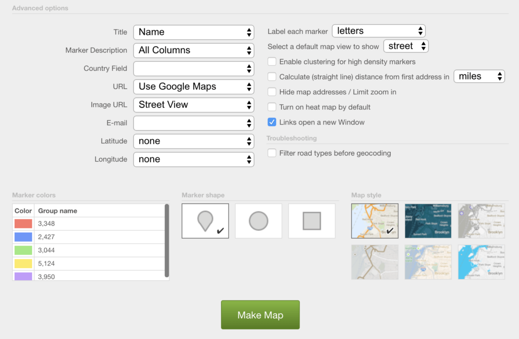
Here you can change the colors and style of markers, alter the underlying map style, and more. While BatchGeo Pro options are shown above, even free versions have a lot of ways to tweak your map.
Try changing some options and see how your map looks. Go back to the edit screen (a link is sent to the email address you used to create the map) and try another option. Make your map fit your individual needs and help uncover the story within your data.
If you’re ready to create some fantastic maps, be sure to see our 5 Steps to Becoming a BatchGeo Power User article, with tips for re-ordering data and including images.