Streamline Your Map Filters in BatchGeo
In the age of DoorDashing from the 7-Eleven across the street and Michelin star microwave dinners, the tools you use for data should be just as convenient. This includes maps, which make it easy to visualize the meaning in your data and can go beyond just showing you the geography of your information.
Our mapping tool takes any additional data you may have and automatically groups it together so that you and your users can easily filter what you want to see in or out. Let’s first go over how to make a map of your data, which you’ll need before getting started with map filters. We’ll also demonstrate how to easily add multiple filters at once. Let’s jump into it.
Make a Map of Your Data
Before you can get started with map filtering, you’ll need a map. Thankfully, it couldn’t be easier to make a custom version, like our largest metropolitan parks example below.
View Metropolitan parks by size in a full screen map
Start by identifying the data for your map. Any location-based nformation can be plotted—be it countries, states, cities, addresses, or even geographic coordinates. You may find desirable data with your business proposals, sales numbers, or even the Wikipedia page of a topic that interests you. If the data isn’t already stored in a spreadsheet, you’ll want to transfer it to Excel, Google Sheets, or any other spreadsheet program. It’s best to include headings and separate columns for the location information. Then, plot your points with the following steps:
- Select and copy the information from your spreadsheet
- Open your web browser and navigate to batchgeo.com
- Click on the location data box with the example data in it, then paste your own data
- Check to make sure you have the proper location data columns available by clicking “Validate and Set Options”
- Select the proper location column from each drop-down
- Click “Make Map” and watch as the tool maps your data
Now let’s find out about map grouping and filtering your newly created map.
Intelligently Group Additional Information
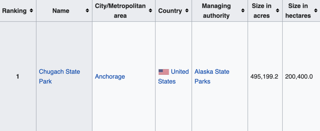
As an entire profession is dedicated to mapping (cartography), simple maps provide valuable insights on their own. However, BatchGeo also finds the best home for any additional data you may have. For example, the largest city parks data contained information about location (city/metropolitan area and country) along with park name.
Interactive Maps Made Easy
Sign Up NowThe location gets mapped while the name ends up as the title. But the data also contained:
- Ranking (1-161)
- Managing authority
- Size (in both acres and hectares)
BatchGeo makes these data columns (and just about any non-location fields in your spreadsheet) available for map grouping. The tool will automatically place any numerical data (like the ranking and sizes in our example) into helpful ranges while textual data gets grouped based on repeat values. This paves the way for you and your map users to select only the markers that meet certain requirements, filtering out the rest.
See What You Want, Filter Out What You Don’t
Custom maps can have upwards of thousands of markers. Seeing them pinned can help you identify geographic trends, but what about your additional groups? You can filter your groups, enabling you and your map users to select only the markers that meet certain requirements—and combinations of requirements. There are a couple of ways to go about viewing only what you want, but perhaps the simplest is to navigate to the lower left dropdown. Then, opt for the group of your choice and select an option from the legend to filter.
Another way to filter is via the search bar in the upper righthand corner of your map. Type in a group or specific range, then select the right one. The map will update to include only the results that match your search, and it will zoom closer to their location. But that’s not the extent of what you can do.
Add Multiple Filters At Once
Narrowing down your map by one value, say the largest range (495K – 7,800 acres), already makes your data more manageable. With a single filter, you isolate 27 out of the 168 city parks on the map. However, you have the option to further your focus with additional filters at once.
Via the dropdown in the lower left of your map, you can mix and match different groups, adding more values in the legend. As you select additional values, the filter grows, showing you only the data you want to see, when you want to see it.
Get a new view into your data with map filtering. Try copy-pasting your Excel spreadsheet into batchgeo.com to start gaining fresh insights.


