Mapping Local Crime Data Online

When Google Maps was released in 2005, one of the first projects to use it externally was ChicagoCrime.org. Though now defunct, the site was built when the hard way to add Google Maps was even harder. It inspired many other community crime maps, and won a Knight-Batten award for innovation in journalism in 2005. Since that time many newspapers have replaced the traditional police blotter with the much more visual map, as you’ll see in these examples below.

Readers use crime maps in many different ways. Some will want to check for incidents in their immediate neighborhood, with most police data reported at the block level. Others will be interested in a larger neighborhood area or the city as a whole. Since most police data is segmented by type, readers may also want to see which incidents are thefts, burglary, or other types of crime.

Example Newspaper Crime Maps

Many newspapers have maps of recent crimes that staff keep updated on their websites. These can be used by both readers and journalists as the seed for future stories.

Evansville Courier and Press

The Evansville Courier and Press in Indiana maintains an impressive daily crime map built with BatchGeo. Each incident includes the address, case number, date, type of incident, and the department that reported it (typically the Evansville Police).

Anniston Star

The Anniston Star of Alabama regularly updates its map of recent crimes, and it lets readers group by the date of the crime. This powerful grouping and filtering feature comes with all BatchGeo accounts, no special coding required.

Milwaukee Community Newspapers

Milwaukee’s Community NOW newspapers are reaching BatchGeo power user status with their frequently updated map. The incident reports can be filtered by incident type, which allows readers and journalists to focus on specific types of crimes.

These are just a handful of crime maps created with BatchGeo. One of the reasons we’re a popular solution is that it’s very easy to create your own.

How to Create a Crime Map

We’ve designed BatchGeo to make map making as easy as copy and paste. Crime maps are the same. Here’s how you can make your own:

  1. Find a data source – This may be the hardest part, but your city should have a way to access police reports. This is very likely open data, after all.
  2. Store your data in a spreadsheet – You should be able to download as Excel or CSV, as is an option in the popular Socrata government datasets. Alternatively, you may be able to copy from a table on the web into a spreadsheet.
  3. Paste the data into BatchGeo – Once your data is in a spreadsheet, it’s ready for BatchGeo. Just copy and paste to make a map from your Excel spreadsheet.
  4. Embed the map in your website (optional) – As with the newspapers mentioned above, embedding maps in your own website helps you control the user experience and looks professional.

Crime is just one of the ways journalists use BatchGeo. Every map tells a story, start telling yours now.

Put Little Debbie on the Map

Little Debbie Star CrunchIf you’re anything like us, you imagine maps everywhere. There really is no better way to visualize geographic data. In your Excel spreadsheets, or hiding in plain sight on Wikipedia, many stories are best told with a map.
This is one of them.

What’s This Have to Do With Little Debbie?

Recently a friend from Portland, Oregon, got back from visiting family on the east coast. He came to visit and brought Star Crunch cookies, a snack made by Little Debbie. It was his childhood favorite, but he hadn’t found it out west. He’d stocked up while back home.

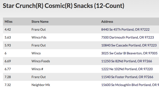
The next day, I discovered the Snack Finder on Little Debbie’s website. I plugged in a Portland zip code and discovered several places that sell Star Crunch, in a long list of store names and addresses.

Star Crunch store list

That’s the perfect opportunity for a BatchGeo map. Three copy-pastes later (I decided to look up the 12 pack, single Star Crunch, and the Big Pack), I had a beautiful, browsable map. This gave him a way to visualize just how close he was to his favorite childhood cookie.

View Portland-area Star Crunch in a full screen map

I simply texted the link to him, with no other information. He was surely impressed, but probably as much due to BatchGeo’s mobile-optimized maps as the answer to his sweet tooth.

Do the Same With Any List of Locations

This isn’t just a story about finding cookies. While these treats are delicious, you’ll find tasty stories everywhere as you browse the Internet. You just need to look for them. You will find data in all sorts of formats, but many will copy-paste nicely into BatchGeo. Check out our open data tutorial for an example of just how easy it can be.

You can use BatchGeo to visualize the data you find. When you plot it on a map, you’re telling a story. Use the maps in a blog post, create a store locator, or just share it with a friend.

Of course, a BatchGeo doesn’t just plot a bunch of marker pins on a map and stop there. Any additional data becomes available within each marker’s info box. And that same data can be grouped or you can create cluster maps to bubble up important insights within the data.

Don’t let your story go untold. Create a BatchGeo map now for free.

How Often Are There Earthquakes in San Francisco?

It’s been 110 years since the great quake of 1906 destroyed San Francisco. Ever since, San Francisco, and California as a whole, has obtained a reputation for these ground-shaking natural disasters. On the anniversary, we thought we’d take a look at every significant California earthquake since 1900 and see just how many are in San Francisco.

California earthquake heat map

For starters, we used our new Advanced Tools to look at a heat map of the data. This takes into account the concentration of individual quakes. The greater Bay Area is certainly a hot zone, though that is a geographically large region. To the North is Santa Rosa, with Santa Cruz to the South. Each of these cities is around 50 miles away from San Francisco.

Next we added a record to the top of our data to serve as the center of San Francisco. Then we had BatchGeo calculate the distance from every earthquake epicenter to that San Francisco data point. With the map below, we can now see how many earthquakes have been near San Francisco.

View California Earthquakes Relative to San Francisco in a full screen map

Using BatchGeo’s grouping feature, we can filter the map to see the earthquakes within about 50 miles of San Francisco. There have only been half a dozen since 1906, and no others that were centered within the city. The closest was a 2014 Napa quake, 30 miles away with a magnitude of 6.

Distance is only one factor. Plate tectonics and magnitude have a lot to say about how far the disastrous effects will travel. The 1989 earthquake that interrupted the Bay Bridge World Series between the Oakland A’s and San Francisco Giants collapsed a section of that bridge, as well as a San Francisco freeway. The epicenter was nearly 60 miles away from San Francisco in the Santa Cruz Mountains.

Expanding the radius to 100 miles still only shows 13 major earthquakes, including both 1906 and 1989, as well as others that did no damage in San Francisco. That leaves another 41 earthquakes elsewhere in California. There are several clustered around Eureka, a small group in the Sierras, and quite a few in the Los Angeles area.

To conclude, in San Francisco you can expect an earthquake every decade or so, but it’s unlikely to match the expectations set by disaster movie San Andreas, the devastation of 1906, or even the World Series postponing shakes of 1989.