Map of Top Colleges in the US
As teenagers return to school in the US, those in their final year of high school will be thinking about where to apply for college. A lot of factors go into what university is a good match for students, and you’ll see plenty of lists that rank them. The map below is based on data from US News about what it calls National Universities. With the top 100 mapped, you can use BatchGeo’s grouping functionality to drill down on what you want to find.
View Top Universities in the US in a full screen map
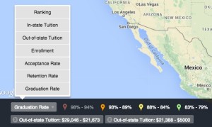
The map is initially grouped by ranking, and we’ve automatically provided ranges for you to select if you want to restrict to only the top or bottom universities. Of course, to make the list, they all have to be pretty good. Choose the menu in the lower left of the map to select other data from the list, including in-state tuition (same as out-of-state for private schools), out-of-state tuition, enrollment (number of students), acceptance rate, retention rate (freshmen who return), and graduation rate (undergraduates who graduate within six years).
You can select a couple groups of one type, then switch types to further restrict the map. For example, click top two ranking groups to see those in the top 11. Then switch to Acceptance Rate. All but two groups will be faded, which tells us that the top 11 does not accept more than 20.4% of applicants (in fact, click through the markers and you’ll see that Duke University, #8, has the highest acceptance rate of the top 11 with 12.4%).
 Perhaps exclusivity is not your thing. Click the group selector to clear your selections, then choose the Out-of-state tuition option. This provides the best apples-to-apples comparison for the cost of college, because in-state tuition typically has strict resident requirements. Choose the lowest three tuition ranges to see all the universities with less than about $30,000 annual cost.
Now, let’s make sure you have the best chance of a speedy graduation. Select Graduation Rate and the markers will switch colors based upon the range to which they belong. The best graduation rate is faded out, but select the second best and you’ll be left with two affordable universities with 90%+ graduation rates: University of California at Berkeley, and University of North Carolina at Chapel Hill.
Interactive Maps Made Easy
Sign Up NowThis map view of top colleges is also useful for the student who wants to get very, very far from their parents. Just identify your home region on the map, then find a marker that isn’t close. For the parents, who want to keep their kids close, we actually have a special tool. Type your home town into the search bar above the map, press enter, and be whisked away to your nearest top school. This built-in feature allows BatchGeo customers to create a store locator tool, but here it does double duty as a school locator. It even works in tandem with the grouping feature, so you could find your closest university with under 13,000 students, for example.
There’s plenty more you can accomplish by exploring the different group types on the map. If you want to create your own map (for colleges or otherwise), we can help you, too. This top college data started as an Excel spreadsheet. What other data do you have in spreadsheets that could be transformed through a web map? Try BatchGeo now.
