Most and Least Environmentally Friendly Countries

April 22 is Earth Day, the day folks around the world post appreciation pics of our planet. However, on April 23, the planet slips to the back of many people’s minds, though this isn’t the case for everyone. Europeans and folks living in East Asia celebrate the Earth year-round by recycling and composting as if their lives depended on it (and they kind of do). Other countries, like Japan, minimize human impact by incinerating their trash. This is better than sending large amounts of trash to landfills as heat from incineration can be used to generate electric power. Then there are the countries that love sending almost all of their waste to the landfill. Clearly some countries are more environmentally aware than others. Let’s take a look at countries doing the most and those that could try a little harder when it comes to waste management and our planet.
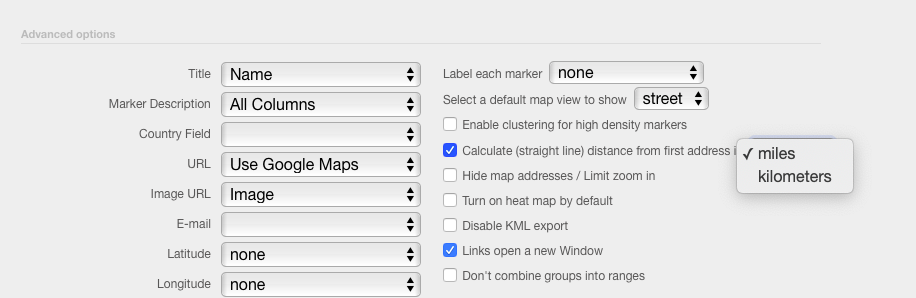
Which countries reduce, reuse, and recycle and which are garbage at disposing of their own? Sort the map by recycling and composting rates, different methods of incineration, and landfilling to find out. Then, read on for trashy trends we’d be rubbish at spotting without the help of a map.

Europe’s Bin Recycling and Composting, Have You?

Unlike the map of the worst statistics about the United States which highlighted some negative environmental impacts of certain U.S. states (Ohio, New Jersey, Delaware, and North Carolina), we’re focusing on locations doing good for the planet. Europe, for example, is slaying the recycling and composting game compared to the rest of the world. It seems that saying au revoir to daylight savings time in 2019 leaves Europeans enough spare time to recycle and compost. Below is the list of countries with recycling and composting rates of 55% or higher, four of which are located in Europe:

  • Germany
  • South Korea
  • Austria
  • Slovenia
  • Belgium
  • Taiwan

The six countries above have the highest recycling and composting rates in the world. Germany takes the cake, recycling and composting 65% of waste. South Korea is second best, ethically getting rid of 59% of its waste. Coming in close behind are Austria and Slovenia, which tie for third place at rates of 58%. Belgium and Taiwan close out the top environmental do-gooders with a 55% rate of recycling and composting. Plus, Switzerland, Sweden, the Netherlands, and Luxembourg deserve honorary mentions for recycling and composting rates 45% of trash.

Japan Incinerates the Competition

Incineration is just a fancy way of saying “burning trash.” While incineration does not eliminate the need for landfills, it does convert trash to smaller, more manageable levels. Incineration reduces waste mass by 83% and its volume by 96% which is why it’s popular in countries where space is limited. Some countries have expressed concerns about incinerators and their effect on the environment. However, not only do incinerators significantly reduce the amount of waste for disposal at landfills, the high temperatures of incinerators can also destroy pathogens and toxins that would alternatively fester in the landfill.

The top three incinerators — incineration without energy recovery on the map — include:

  • Germany
  • Japan
  • Canada

These three countries limit the amount of space waste takes up in landfills by incinerating a percentage of it. Just like with the highest rate of recycling and composting, Germany has the best rate of incineration without energy recovery: 13%. Japan comes in second with a rate of 6%, though this isn’t the last we’ll hear of Japan’s aptitude for incineration. Third place goes to Canada. Canada incinerates 4% of its waste without energy recovery.

Incinerating is a step above landfilling, even more so when utilizing incineration with energy recovery. This type of incineration generates energy that can be used for other purposes like electricity or heat.

The largest incinerators with energy recovery are:

  • Japan
  • Norway
  • Denmark

These countries incinerate their trash in the most environmentally-friendly way possible: with energy recovery. Japan does it the best at a rate of 71%. If you recall, Japan also had the second highest rate of incineration without energy recovery. Japan’s tendency to incinerate its trash may be because incineration is extra popular in countries with limited space, like Japan. Norway has the next highest incineration with recovery rate: 57%. Denmark follows with 54% of its waste being incinerated with energy recovery. Sweden — at 50% — also deserves recognition as it is the last country with a rate of incineration with energy recovery over 49%.

Remember when we noted that Austria and Slovenia tied for third when it comes to recycling and composting? They also tied with 0% rates of incineration without energy recovery. But while these two countries have identical recycling and composting rates and the same incineration without energy recovery rate, their incineration with energy recovery rates aren’t anywhere close. Austria has Slovenia beat big time when it comes to incineration with energy recovery. Austria does this at a rate of 35% while Slovenia incinerates with energy recovery just 1% of the time.

Countries that Love Landfills

Photo by Hermes Rivera on Unsplash

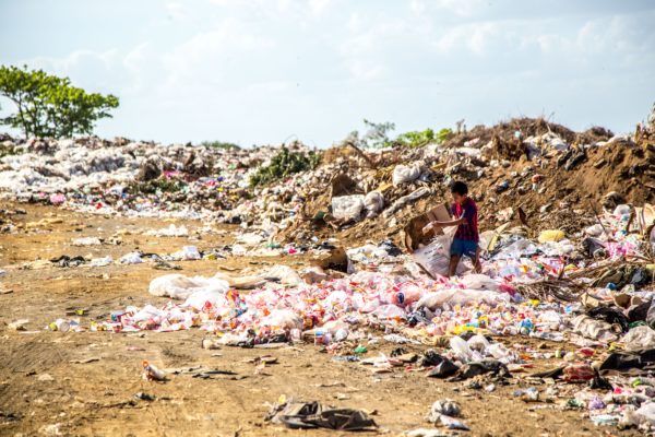
We mostly focused on the positives up until now. But when it comes to landfills, there are only negatives. Air pollution, contaminated water, unwanted health effects, unworkable soil and land, high economic costs, and fires are only a few drawbacks of landfills. So when you group the map by landfills, keep in mind that countries with higher rates aren’t the ones doing the most for the environment. The countries that appear to love landfills include:

  • New Zealand
  • Turkey
  • Chile
  • Mexico
  • Israel
  • Greece

New Zealand, Turkey, Chile, Mexico, Israel, and Greece certainly have some explaining to do. With landfilling rates like New Zealand’s (100%), Turkey and Chile’s (99%), Mexico’s (95%), and Israel and Greece’s (81%), who needs enemies! But we also have some explaining to do. The data we used to make the map is from a Wikipedia table. Wikipedia is a great resource to find data that can be easily transported to a spreadsheet and copied and pasted into our spreadsheet data mapper. However, we’re also aware Wikipedia’s data may not be 100% accurate. Though it’s safe to say the countries with high rates of landfilling —according to Wikipedia — likely aren’t the most environmentally friendly places.

We noted that Austria and Slovenia tie when it comes to rates of recycling and incineration without energy recovery. Yet, Austria’s rate of incineration with energy recovery (35%) is much better than Slovenia’s (1%). Just like their un-identical incineration with energy recovery rates, Austria and Slovenia aren’t close when it comes to landfilling. Once again, Slovenia falls behind Austria. Slovenia sends a whopping 36% of its trash to the landfill while Austria does the same with just 4% of its waste. In addition to Austria, let’s give it up for the eight countries that have landfilling rates below 5%: Germany and Switzerland (0%), Belgium, Sweden, the Netherlands, and Japan (1% each), and Denmark and Norway (2%).


For U.S. mappers, let’s aim to get our country higher up in the ranks. We’re currently ranked 15th in both recycling and landfilling. And be sure to check out the world’s highest electricity usage to see which countries may want to consider relying on incineration with energy recovery to bring their electricity rates down. A lower electric bill and less in the landfill is a win-win in our book. We also wonder if the many different drinking ages across the globe have any effect on recycling rates. Beer cans are recyclable, right?

Create a Virtual Wedding Map Guide for Your Guests

Destination weddings are great, but what happens when your guests have downtime in between the loved-up festivities? You and your partner-to-be can’t play tour guide to everyone. After all, you’ll both be busy with wedding preparations, and you know, tying the knot. Even if you opt for a local wedding, you’re likely to invite a few out-of-towners who are unfamiliar with the area. So what can you do to help your guests navigate the area surrounding your wedding venue? Create a paperless, easy-to-make virtual wedding guide! Whether your guests are looking for lodging options, restaurants, a quick stop at a grocery store, fun things to do, or wedding day location logistics, a virtual wedding guide is a great tool to ensure your wedding goes smoothly.

View Hawaiian Wedding Guide in a full screen map

Just like a map of your location and favorite places, a wedding guide can help guests navigate the area surrounding your venue and take some stress off your shoulders. So keep reading for instructions on how to make your own virtual wedding guide for your friends and family.

Determine What to Do in the Surrounding Area

The first step of creating a virtual wedding guide is to determine what there is to do in the area surrounding your wedding venue. It’s helpful in your mapping endeavors if you already know all about the nighttime scene, unique hikes, or famous botanical gardens of the area. Perhaps you’ve already mapped your highlights from hiking, geocaching, or walking around the area! However, unfamiliarity with the area shouldn’t stop you from creating a virtual wedding guide. Turn to Google to help you determine what places to add to your wedding guide.

For example, if your wedding venue is the beautiful Haiku Mill located in Hawaii, enter that into Google Maps. Here, you can select the “Nearby” option to see the restaurants, hotels, bars, and pubs near the venue you may want your guests to know about. Then, jot them down! A spreadsheet is a perfect place to keep track of all the spots your guests might like to check out.

Create a Spreadsheet and Copy & Paste into the Mapping Tool

Now you can go ahead and add all of the amazing places you discovered to a spreadsheet. You’ll want to use column headings like the name of the location and “type” or “category.” These group-able categories (like restaurants, hotels, or fun thing to do) will come in handy later. Of course, don’t forget to note the address of these places since we’re going to be plotting them on a map! Below is an example of our spreadsheet:

Location Address Type
Haiku Mill 250 Haiku Rd, Haiku, HI 96708 Wedding Venue
St Rita’s Church 655 Haiku Rd, Haiku, HI 96708 Fun Things To Do
Twin Falls 6280 Hana Hwy, Haiku, HI 96708 Fun Things To Do
The Gardens 800 Haumana Rd, Haiku, HI 96708 Fun Things To Do
Ho’okipa Beach Park Hana Hwy, Paia, HI 96779 Fun Things To Do
Haiku Market 810 Haiku Rd #143, Haiku, HI 96708 Grocery
Fukushima Store 815 Haiku Rd, Haiku, HI 96708 Grocery
Pauwela Store 375 W Kuiaha Rd, Haiku, HI 96708 Grocery
Haiku Plantation Inn: Maui Bed and Breakfast 555 Haiku Rd, Haiku, HI 96708 Hotel
Bamboo Valley Inn 1444 W Kuiaha Rd, Haiku, HI 96708 Hotel
The Inn At Mama’s Fish House 799 Poho Pl, Paia, HI 96779 Hotel
Maui Adventure Villa 190 Kaokoa Way, Haiku, HI 96708 Hotel
Kaiholo Hale 25 Kaiholo Pl, Paia, HI 96779 Hotel
Veg Out 810 Kokomo Rd, Haiku, HI 96708 Restaurant
Colleen’s At the Cannery 810 Haiku Rd, Haiku, HI 96708 Restaurant
Nuka 780 Haiku Rd, Haiku, HI 96708 Restaurant
Maui Kombucha 810 Kokomo Rd, Haiku, HI 96708 Restaurant
Mediterranean Grill 810 Haiku Rd #1, Haiku, HI 96708 Restaurant
Bailey’s Café 810 Haiku Rd, Haiku, HI 96708 Restaurant
Kings BBQ 810 Kokomo Rd, Haiku, HI 96708 Restaurant
Mangala Yoga 810 Kokomo Rd #102, Haiku, HI 96708 Wellness
Three Treasures Inc. 718 Haiku Rd, Haiku, HI 96708 Wellness
MALIE DAY SPA 810 Kokomo Rd #201, Haiku, HI 96708 Wellness

Now that you’ve gathered the exciting places guests can visit in a spreadsheet, simply copy and paste your data into our map-making tool for a wedding guide that looks something like this:

Guests Can Calculate Distances Between Important Locations

With your new paperless wedding guide your guests can calculate the distance between two markers on the map. To enable this option, right click on your map and select “Edit Map.” Then, scroll down and click “Validate and Set Options.” Next, select “Show Advanced Options.” Check the box for “Calculate (straight line) distance from first address” and note your preferred units of measurement. Finally, click “Make Map,” and you’re good to go!

Since this is a wedding guide, we recommend the first address (from which the map will now automatically calculate distances) be your wedding venue. After all, it is the most important point on a wedding map! Now, if Uncle Bucky intends to stay at the Inn At Mama’s Fish House, he’s easily able to see it’s 2.47 miles away from the venue.

Moreover, your guests may want to calculate the distance from a marker on the wedding guide other than the first address. And with BatchGeo Pro, they can easily do that! Measure on the fly with the measuring tool (it looks like a ruler!) in the top left corner of your wedding map. Using the measuring tool, drag a line between any two markers on the map and BatchGeo will let you know exactly how far apart they are. As when we calculated distances from the first address, you’re able to toggle between units of measurement with the measuring tool. To do so, click the scale on the bottom right of your map to switch between feet and meters. The measuring tool and the option to calculate distances from the first address are available with the Advanced Mode in BatchGeo Pro which opens up more opportunities for data insight.


Now that a virtual wedding map solved the problem of playing tour guide to your wedding guests, you’ve got more time to move — literally — on to other ways maps can help with important relationship milestones: moving in together.

This map has got everything you need to make the most financially-informed decision about moving. Then, once you’ve identified the new city or state with the best rent prices, you can apartment hunt visually with a custom map or even make an open house map if you and your spouse are looking to buy a home.

How to Analyze Data in Excel Like an Expert

There’s a lot to understand within Excel. Most of us don’t use much of its most powerful tools. Even if you’ve mastered the advanced Excel formulas, there’s still a lot left to explore.

In this post, we’ll look at two data analysis methods that experts use to make more sense of their data. In each case, you’ll learn to visualize data: in a summary table and in a Google Map. Your type of data will determine which is most useful.

Basic Data Analysis with Pivot Tables

If you’ve been asked to “drill down”, process, or explain an extremely large dataset in excel, then you’ll want to make Pivot Tables part of your repertoire. Pivot Tables are an Excel feature that allows you to calculate, summarize, and analyze data.

Unlike other forms of data analysis, you don’t need to do very much to prepare your data. No need to arrange all the data alphabetically from top to bottom, ensure all decimals are set to a specific count, and you don’t need to remove your other formatting. All that’s required is a header at the top so Excel knows what category your data will fall into when pivoting.

Our data above has the headers of Date, Agent, and Sales so Excel will know what to define the dates, names, and dollars under once the pivot begins. Let’s build!

Within Excel, click the Insert Tab → Pivot Table. This will automatically grab the data on the worksheet and offer to create a pivot table.

As shown, Excel defaults to creating a new table and on a new worksheet and adds data to the data model for the Pivot Table. Typically you won’t need to play with any settings here and instead just click OK to continue. You’ve now created a basic Pivot Table, but let’s check out the settings.

Every good pivot tabler knows though the real driving force of a table are its fields. Remember earlier how we ensured that we added Date, Agent, and Sales as column headers? Well, those have now become our pivot table fields. These fields can be placed into the bottom to create a dynamic cross section that can be used for all sorts of examination.

Start by clicking the checkbox next to each field. Excel will auto-assign the field to what it believes is the best corresponding section. Sometimes this is all you need to do but with more intensive data, you’ll want to adjust the data to match what you want to see. Here are a few examples of what the data will look like and their corresponding pivot table.

View Sales by Agent and Date

Default settings after clicking each of our boxes puts the Date in the Columns area, Agents in our Row area and Sum of Sales in our values area.

What we get is a run down of how each agent performed for each day listed and a grand total over the course of time within.

Filter by a Specific Agent

Sometimes you don’t want to see all the data, even when it’s summarized. Building off the previous example, we can actually filter by the agent and get a whole different view of the statistics.

To see Jim’s totals for instance, you’d click the dropdown box on Row Labels → Uncheck Select All → Check Jim → then Click OK.

Oh look! A brand new analysis showing only Jim’s totals and dates so now we know how well Jim performed based on our original data.

View Sales by Date (with Agent Breakdown)

Perhaps we’re more interested in how well sales did per day in our data. Unfilter the previous example and swap the Date and Agent field from their spot in Columns to Rows and vice versa.

Now we have a nice analysis of how our fictional company did for each date listed.

Pretty great right? Even more ways to view the data can be done by stacking the Date field below the Agent field in the Rows area or vice versa. Play around with how you’d like it to look and what makes sense to you and you’ll be analyzing data in no time!

Format the Data in Your Pivot Table

You may have noticed there’s something a little off about our pivot examples. Each and every time we’ve changed it, our actual values seem to be lacking a little something: the dollar sign!

Every field within the Values area of a Pivot Table can be customized in various ways. With our default settings, we have Sum of Sales, but we can change that however we’d like. To edit a field within the Values area, click the drop down on the field and then click Value Field Settings.

From here, we have a few excellent options to really display your sales data in a different way.

To change our numbers to have dollar symbols, we would start from Value Field Settings, then click Number Format. This next window should look extremely familiar as it is the same format field from everything else you do within Excel. If you choose either Currency or Accounting, we will now see our dollars back on display which makes things a whole lot clearer.

Create Advanced Pivot Tables

Once you have the basics of Pivot Table creation and field editing down, there’s so much more you can get into. Let’s take a look at one more example and get a little more intricate. You’ll apply your new Pivot Table skills, as well as some new tricks, to understand if Acme Incorporated made or lost money in 2018.

Here’s our sample data:

Let’s start by first making a Pivot Table using our data.

For this Pivot Table, let’s walk through our process to intelligently see if we made profit in 2018. For this example, we’ll be creating a pivot table that displays each agent’s name in the rows, adds the accounting type in the columns, provides a grand total in dollars for all and also is filterable by date and account.

  1. Add the Date and Account fields to the Filter Area. Order doesn’t matter as they are filtered independently.
  2. Add the Accounting Type field to the Columns area.
  3. Add the Agent Field to the Rows Area
  4. Add the Amount field to the Values field

Now use your formatting prowess to display the numbers: edit the amount field number format to be Currency and check the option to display negative numbers in read and parenthesis.

And voila! These changes now provide a powerful analysis covering a full year’s worth of data in a matter of seconds and mouse clicks. 2018 proved profitable for Acme Incorporated with 14 million in profit and the most profitable agent being Kelly.

This is just the cusp of what can be done with Pivots, but this knowledge alone will get you super far with your data analysis. Real quick, we’ll outline a few more advanced tricks you can use to make your data analysis with Pivot Tables work even better.

Replace empty cells or error values in data with 0s

  • With a cell in your pivot table selected, navigate to the contextual PivotTable Tools ribbon and click on the Analyze tab then options on the far left.
  • Within this new menu, locate the Format section
  • You can put a check into either For error values show: or For empty cells show: and then add the value 0 into the input box.
  • What this will do is add a value into those places where your base data may have errors and allow it to compute correctly regardless of if someone botched the actual entry before. This saves countless time and if something doesn’t add up, now you can look for 0s within the Pivot Table and head back to the core data to fix it.

Refresh Pivot Table Data whenever you open the workbook

  • Click Options from the left side of the Analyze tab under the contextual PivotTable Tools ribbon.
  • Click the Data Tab then check Refresh Data when opening the file.
  • This will ensure your pivot table data will always update depending on what is in your base data saving you LOTS of time.

Add a slicer

Once of a data analyst’s favorites, adding a slicer to a pivot table gives a clean way to filter the data and is very intuitive for someone who has never touched a pivot. In other words, you can share your Excel document with someone else and let them click a few buttons to see some numbers and start data analyzing with the best of them.

  • To add a slicer, Click the Analyze tab under the contextual PivotTable Tools ribbon. Next, select Filter → Insert Slicer
  • Next, you can pick exactly what you’d like to filter by and as you click each option, it will auto sort the data in your table to match!
  • To clear the slicer, click the filter with a red x in the top right corner and your data will turn right back.
  • Another great way to use a slicer is to have one for each filter you’d like to see. For example, we could make one for an agent, accounting type, and account then drill down depending on what we click on each slicer!

Perform Geographic Data Analysis with a Map

Pivot Tables are great ways to analyze data within Excel. If you have geographic data, such as addresses or cities, you’ll want to display it on a map. BatchGeo can help you visualize location data.

For example, you can take sales data by location from Excel and display it in a clustered map.

View Household income, average clustering in a full screen map

Or filter by specific groups of data, choosing which to include or remove from the map.

View Graduation Rates vs Incarceration Rates in a full screen map

Create Your First Map for Free

Use the Excel mapping tool to copy-paste your data from your spreadsheet directly to a map, no coding necessary.